Preprocess
The module of preprocess contains methods that are processes that could be made to data before training.
Visualize Feature
This method was created due a quick solution to long time calculation of Pandas Profiling. This method give a quick visualization with small latency time.
Code Example
The example uses a small sample from of a dataset from kaggle, which a dummy bank provides loans.
Let’s see how to use the code:
import pandas as pd

from matplotlib import pyplot as plt

from ds_utils.preprocess import visualize_feature

loan_frame = pd.read_csv(path/to/dataset, encoding="latin1", nrows=11000,
                             parse_dates=["issue_d"])
loan_frame = loan_frame.drop("id", axis=1)


visualize_features(loan_frame["some feature"])

plt.show()
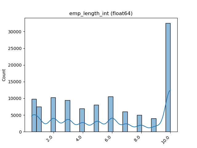
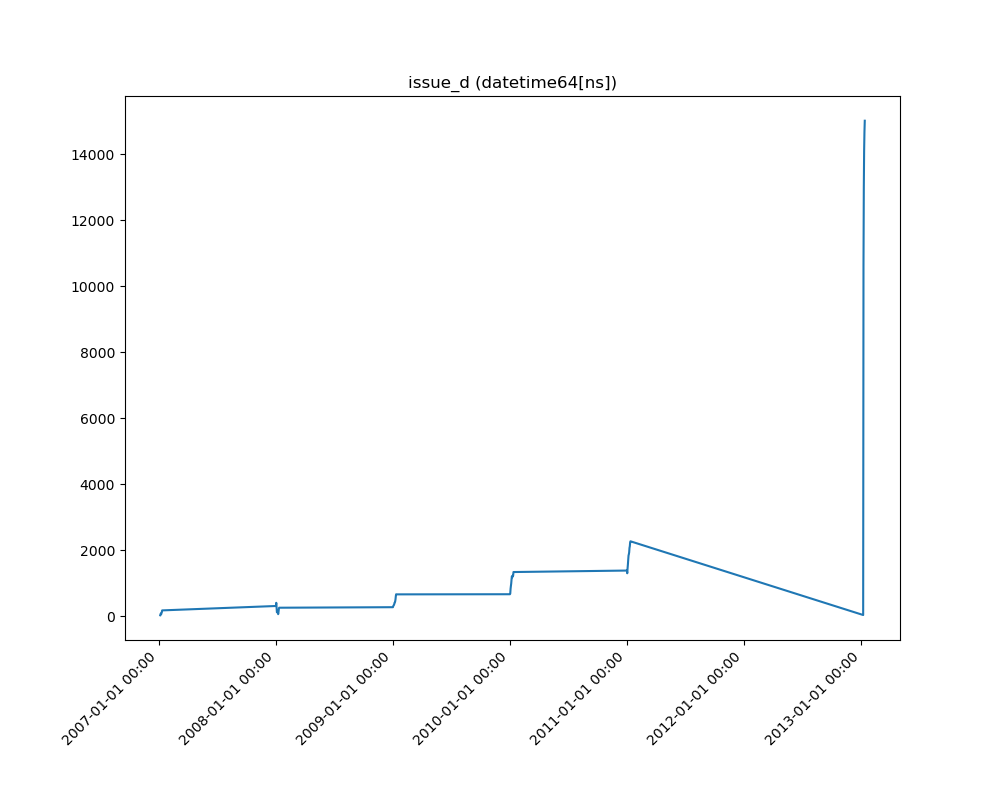
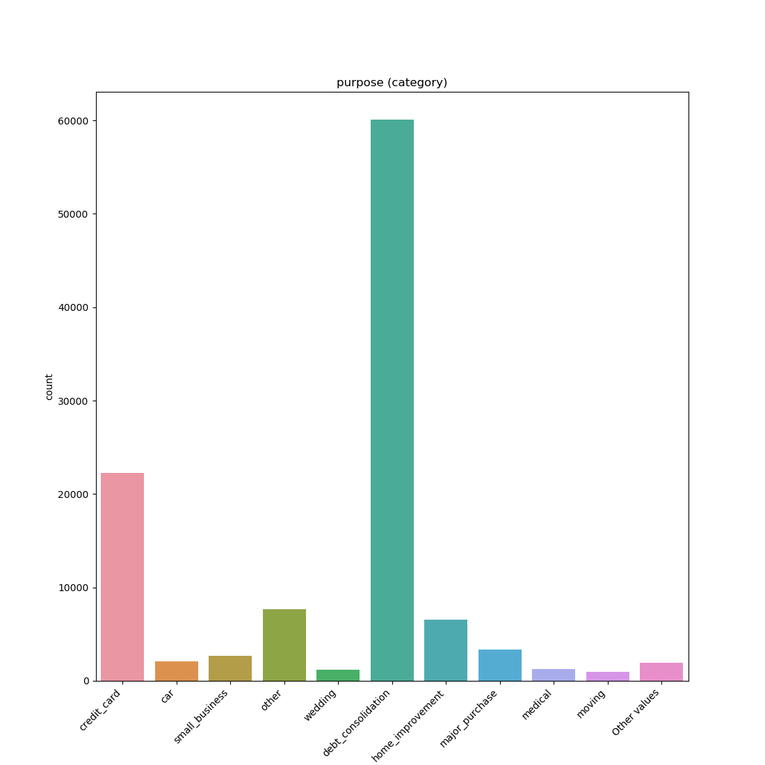
For ech different type of feature a different graph will be generated:
Float
A distribution plot is shown:
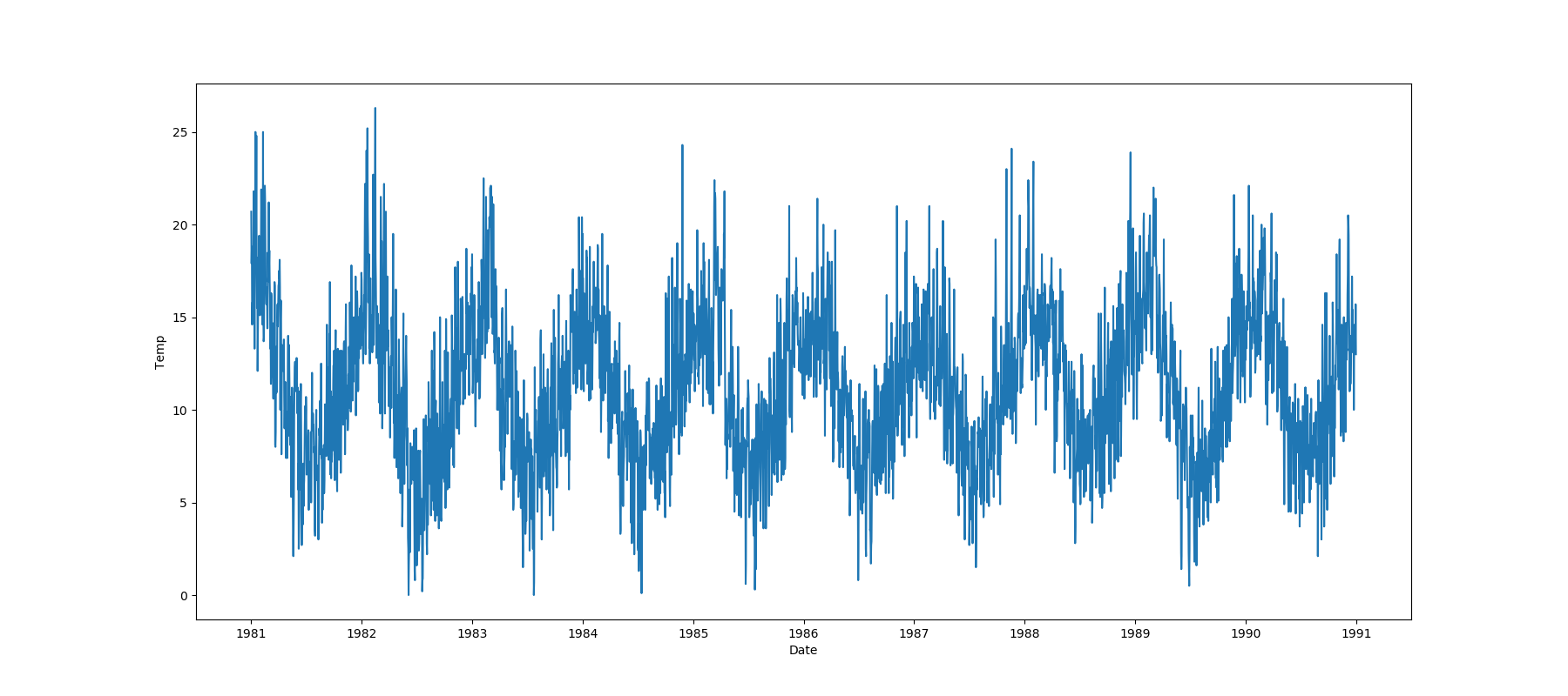
Datetime Series
A line plot is shown:
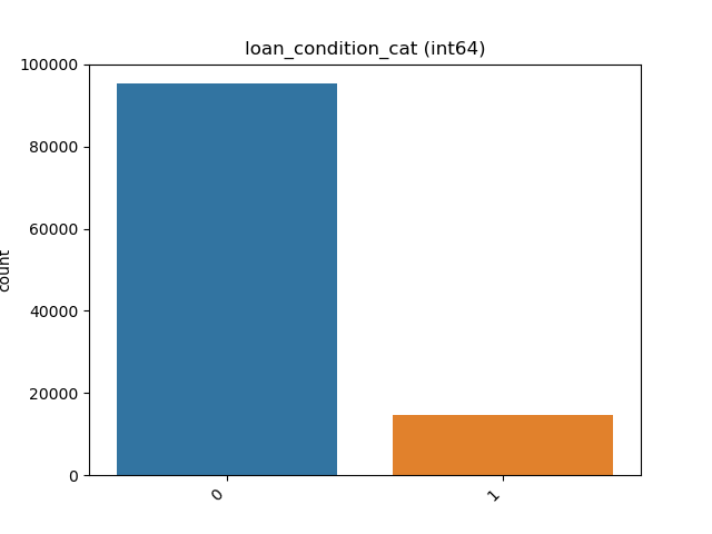
Object, Categorical, Boolean or Integer
A count plot is shown.
Categorical / Object:
If the categorical / object feature has more than 10 unique values, then the 10 most common values are shown and the other are labeled “Other Values”.
Boolean:
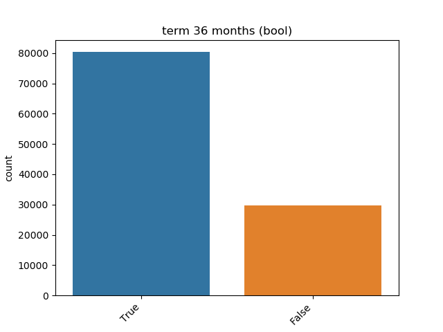
Integer:
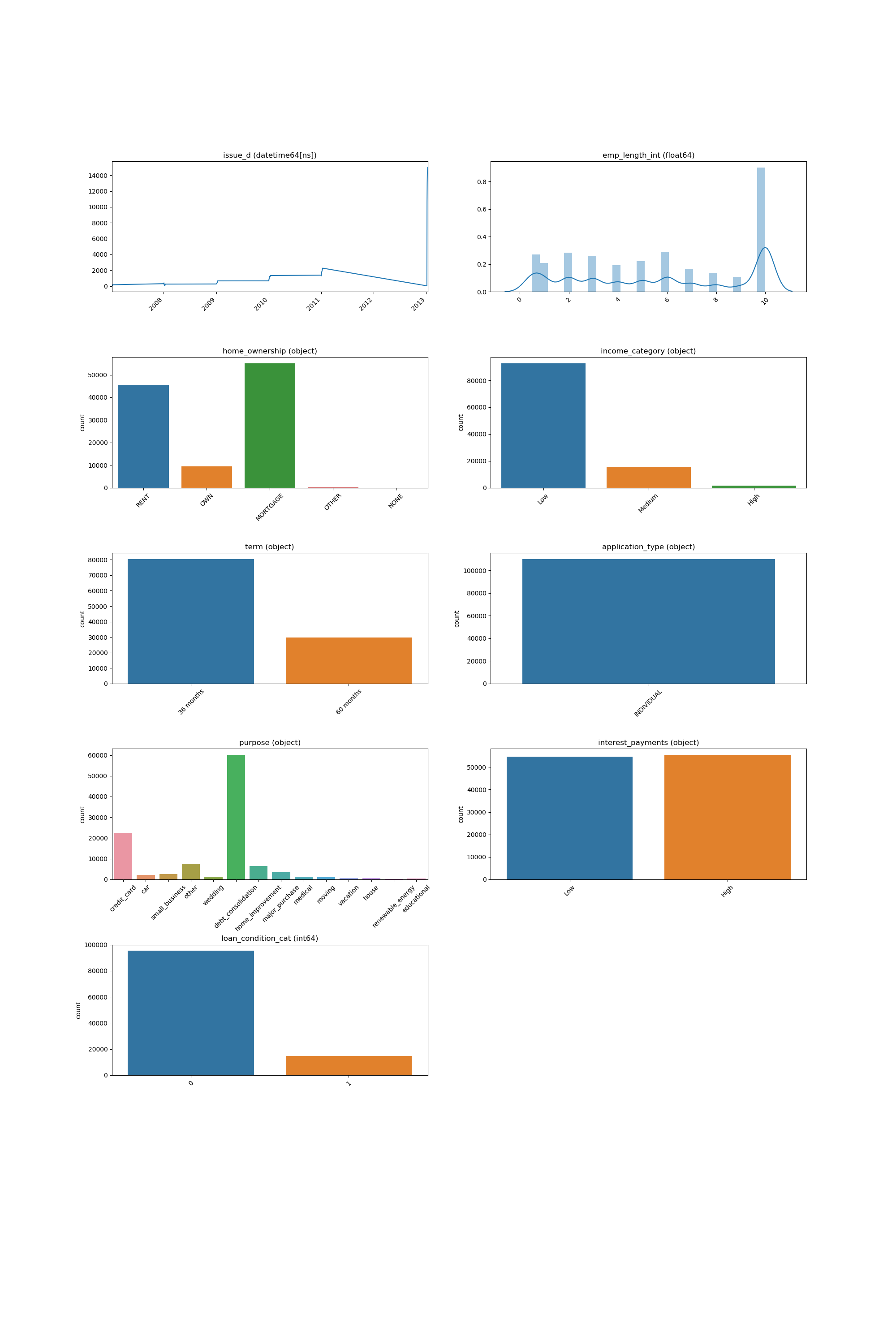
Looping Over All the Features
This code example shows how a loop can be constructed in order to show all of features:
import pandas as pd

from matplotlib import pyplot as plt

from ds_utils.preprocess import visualize_feature


loan_frame = pd.read_csv(path/to/dataset, encoding="latin1", nrows=11000,
                             parse_dates=["issue_d"])
loan_frame = loan_frame.drop("id", axis=1)

figure, axes = pyplot.subplots(5, 2)
axes = axes.flatten()
figure.set_size_inches(18, 30)

features = loan_frame.columns
i = 0

for feature in features:
    visualize_feature(loan_frame[feature], ax=axes[i])
    i += 1

figure.delaxes(axes[9])
plt.subplots_adjust(hspace=0.5)
plt.show()
And the following image will be shown:
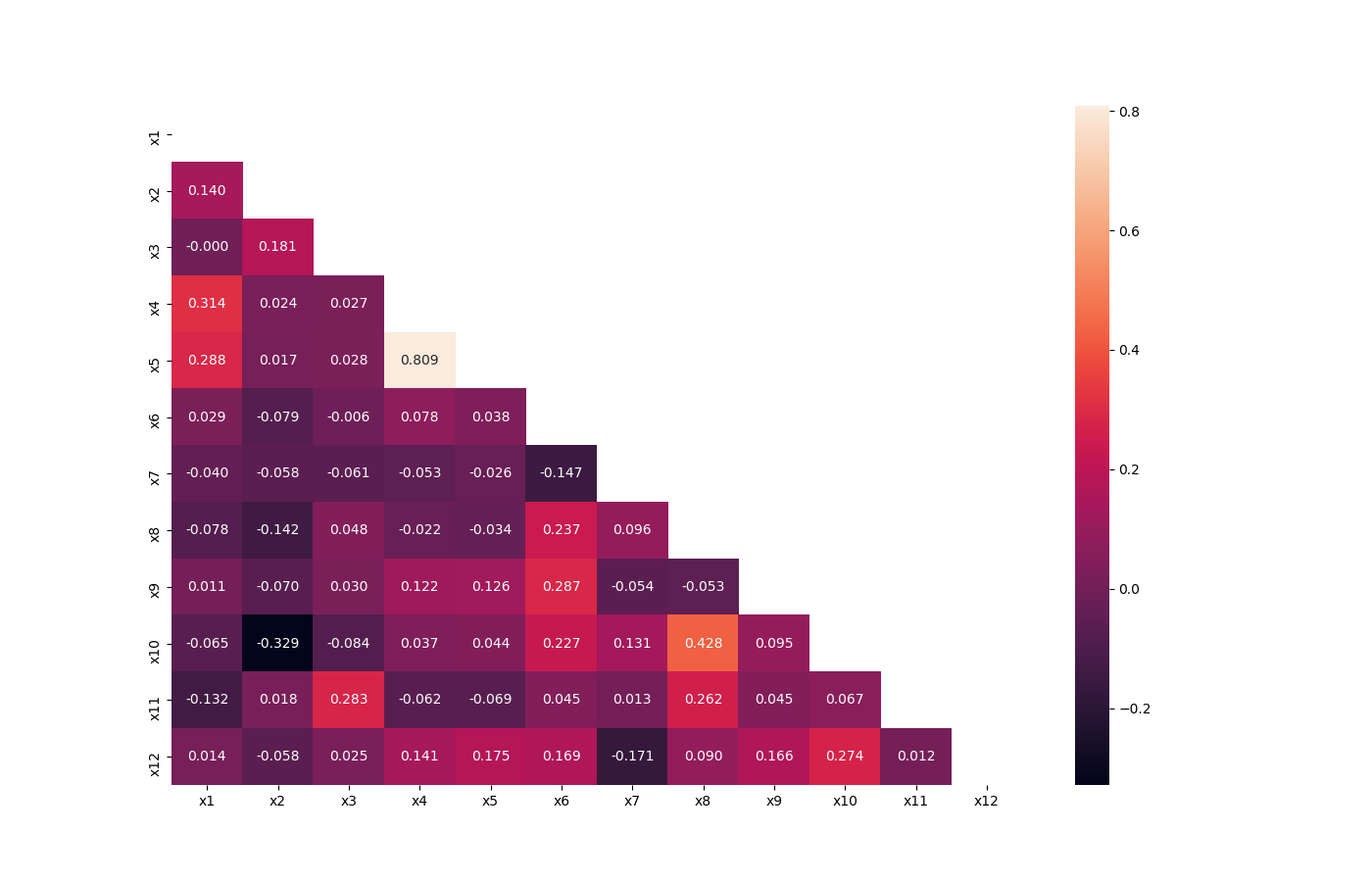
Visualize Correlations
This method was created due a quick solution to long time calculation of Pandas Profiling. This method give a quick visualization with small latency time.
Code Example
For this example I created a dummy data set. You can find the data at the resources directory in the packages tests folder.
Let’s see how to use the code:
import pandas as pd

from matplotlib import pyplot as plt

from ds_utils.preprocess import visualize_correlations


data_1M = pd.read_csv(path/to/dataset)
visualize_correlations(data_1M)
plt.show()
And the following image will be shown:
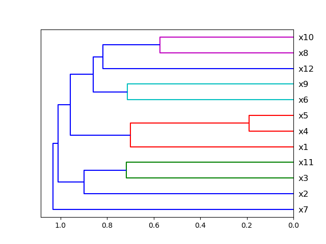
Plot Correlation Dendrogram
This method was created due the lack of maintenance of the package EthicalML / xai.
Code Example
For this example I created a dummy data set. You can find the data at the resources directory in the packages tests folder.
Let’s see how to use the code:
import pandas as pd

from matplotlib import pyplot as plt

from ds_utils.preprocess import plot_correlation_dendrogram


data_1M = pd.read_csv(path/to/dataset)
plot_correlation_dendrogram(data_1M)
plt.show()
And the following image will be shown:
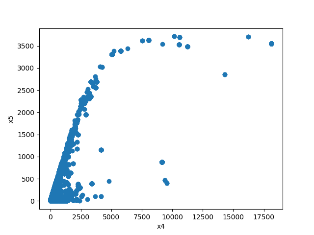
Plot Features’ Interaction
This method was created due a quick solution to long time calculation of Pandas Profiling. This method give a quick visualization with small latency time.
Code Example
For this example I created a dummy data set. You can find the data at the resources directory in the packages tests folder.
Let’s see how to use the code:
import pandas as pd
from matplotlib import pyplot as plt
from ds_utils.preprocess import plot_features_interaction
data_1M = pd.read_csv(path/to/dataset)
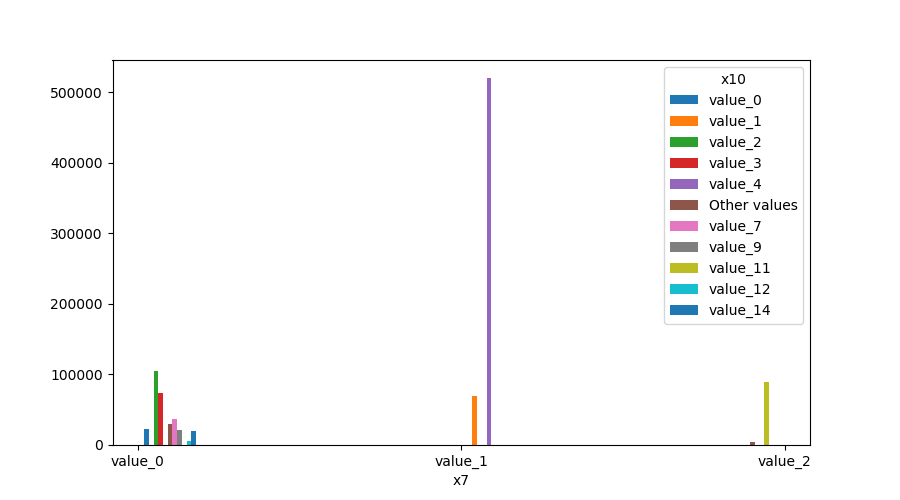
plot_features_interaction("x7", "x10", data_1M)
plt.show()
For each different combination of features types a different plot will be shown:
Both Features are Numeric
A scatter plot of the shared distribution is shown:
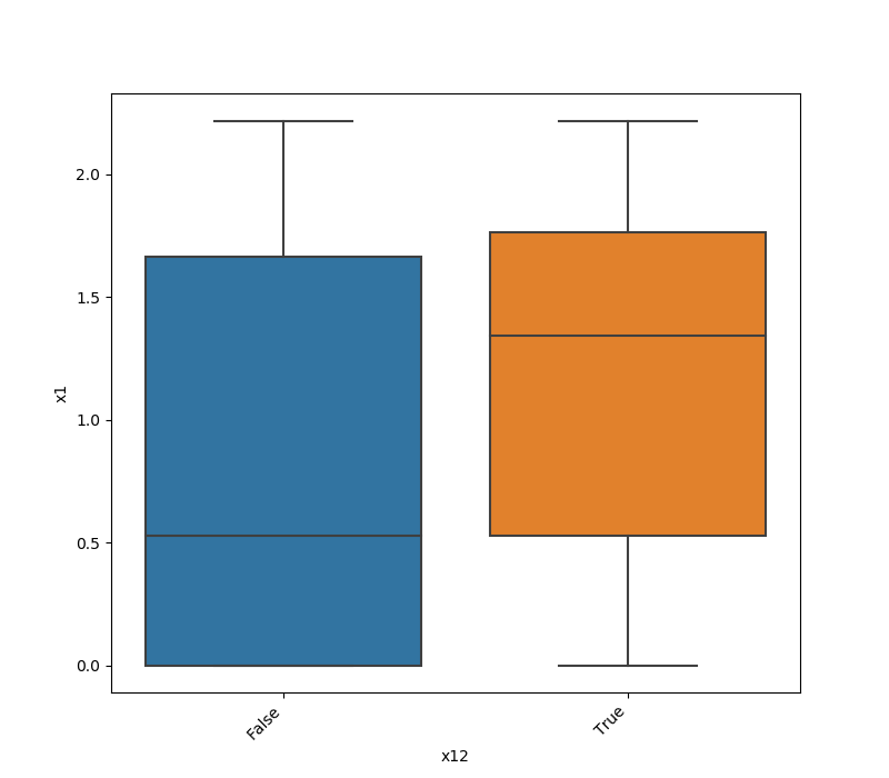
One Feature is Numeric and The Other is Categorical
If one feature is numeric, but the the other is either an object, a category or a bool, then a box
plot is shown. In the plot it can be seen for each unique value of the category feature what is the distribution of the
numeric feature. If the categorical feature has more than 10 unique values, then the 10 most common values are shown and
the other are labeled “Other Values”.
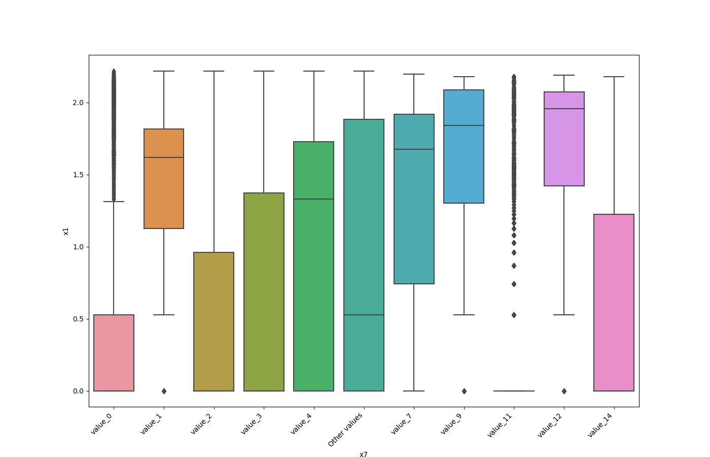
Here is an example for boolean feature plot:
Both Features are Categorical
A shared histogram will be shown. If one or both features have more than 10 unique values, then the 10 most common values are shown and the other are labeled “Other Values”.
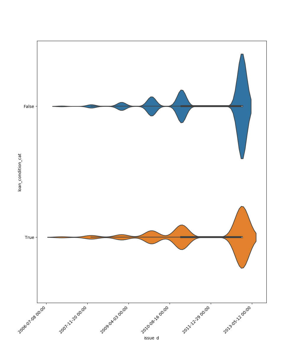
One Feature is Datetime Series and the Other is Numeric or Datetime Series
A line plot where the datetime series is at x axis is shown:
One Feature is Datetime Series and the Other is Categorical
If one feature is datetime series, but the the other is either an object, a category or a bool, then a
violin plot is shown. Violin plot is a combination of boxplot and kernel density estimate. If the categorical feature
has more than 10 unique values, then the 10 most common values are shown and the other are labeled “Other Values”. The
datetime series will be at x axis:
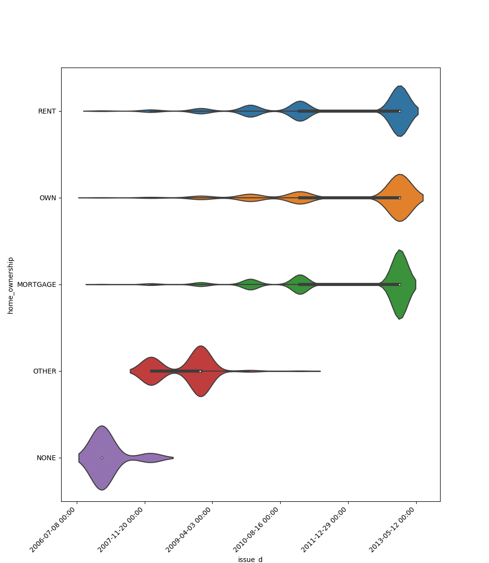
Here is an example for boolean feature plot:
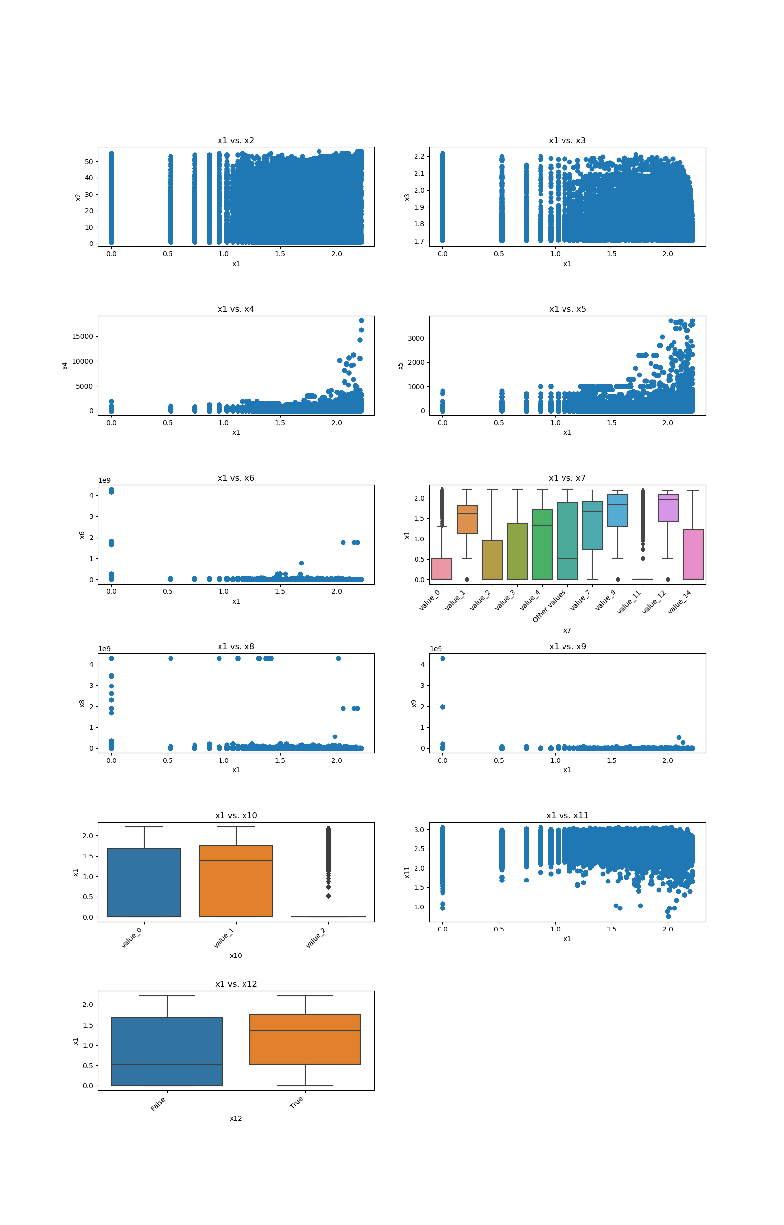
Looping One Feature over The Others
This code example shows how a loop can be constructed in order to show all of one feature relationship with all the others:
import pandas as pd

from matplotlib import pyplot as plt

from ds_utils.preprocess import plot_features_interaction


data_1M = pd.read_csv(path/to/dataset)

figure, axes = pyplot.subplots(6, 2)
axes = axes.flatten()
figure.set_size_inches(16, 25)

feature_1 = "x1"
other_features = ["x2", "x3", "x4", "x5", "x6", "x7", "x8", "x9", "x10", "x11", "x12"]

for i in range(0, len(other_features)):
    axes[i].set_title(f"{feature_1} vs. {other_features[i]}")
    plot_features_interaction(feature_1, other_features[i], data_1M, ax=axes[i])

figure.delaxes(axes[11])
figure.subplots_adjust(hspace=0.7)
plt.show()
And the following image will be shown: