XAI (Explainable AI)
The xai module contains methods that help explain model decisions.
For this module to work properly, Graphviz must be installed. Use the following commands based on your operating system:
For Linux-based systems:
sudo apt-get install graphviz
For Windows:
choco install graphviz
For macOS:
brew install graphviz
Using conda:
conda install graphviz
For more information, see the Graphviz download page.
Draw Tree
Deprecated since version 1.6.4: Use sklearn.tree.plot_tree instead
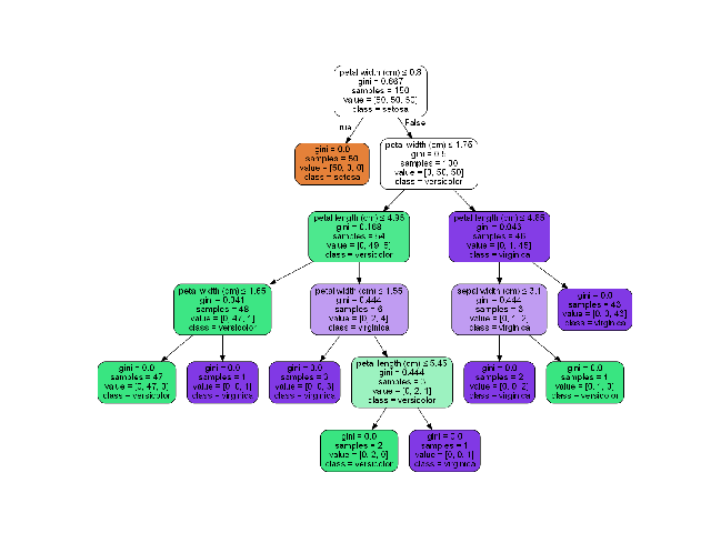
The draw_tree function visualizes a decision tree classifier, making it easier to understand the tree’s structure and decision-making process. This can be particularly useful for model interpretation and debugging.
- ds_utils.xai.draw_tree(tree: BaseDecisionTree, feature_names: List[str] | None = None, class_names: List[str] | None = None, *, ax: Axes | None = None, **kwargs) Axes[source]
Plot a graph of the decision tree for easy interpretation.
- Parameters:
tree – Decision tree.
feature_names – List of feature names.
class_names – List of class names or labels.
ax – Axes object to draw the plot onto, otherwise uses the current Axes.
kwargs – Additional keyword arguments passed to matplotlib.axes.Axes.imshow().
- Returns:
Axes object with the plot drawn onto it.
Code Example
In the following example, we’ll use the iris dataset from scikit-learn:
from sklearn import datasets

iris = datasets.load_iris()
X = iris.data  # Use uppercase 'X' for feature matrix
y = iris.target
Now, let’s create a simple decision tree classifier and plot it:
import matplotlib.pyplot as plt
from sklearn.tree import DecisionTreeClassifier
from ds_utils.xai import draw_tree

# Create decision tree classifier object
clf = DecisionTreeClassifier(random_state=0)

# Train model
clf.fit(X, y)

# Draw the tree
draw_tree(clf, iris.feature_names, iris.target_names)
plt.show()
The following image will be displayed:
Draw Dot Data
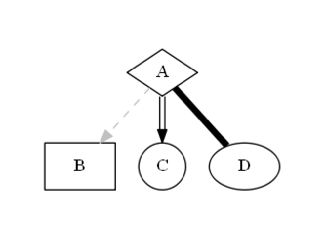
The draw_dot_data function visualizes graph structures defined in DOT language. This is useful for creating custom graph visualizations, including decision trees, flowcharts, or any other graph-based representations.
- ds_utils.xai.draw_dot_data(dot_data: str, *, ax: Axes | None = None, **kwargs) Axes[source]
Plot a graph from Graphviz’s Dot language string.
- Parameters:
dot_data – Graphviz’s Dot language string. Use sklearn.tree.export_graphviz to generate the dot data string.
ax – Axes object to draw the plot onto, otherwise uses the current Axes.
kwargs – Additional keyword arguments passed to matplotlib.axes.Axes.imshow().
- Returns:
Axes object with the plot drawn onto it.
- Raises:
ValueError – If the dot_data is empty or invalid.
Code Example
Let’s create a simple diagram and plot it:
import matplotlib.pyplot as plt
from ds_utils.xai import draw_dot_data

dot_data = """
digraph D {
    A [shape=diamond]
    B [shape=box]
    C [shape=circle]

    A -> B [style=dashed, color=grey]
    A -> C [color="black:invis:black"]
    A -> D [penwidth=5, arrowhead=none]
}
"""

draw_dot_data(dot_data)
plt.show()
The following image will be displayed:
Generate Decision Paths
Deprecated since version 1.8.0: Use sklearn.tree.export_text instead
Plot Feature Importance
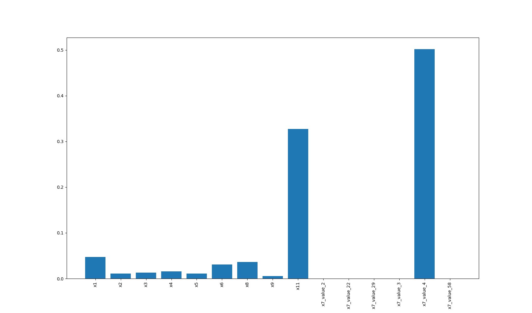
The plot_features_importance function visualizes the importance of different features in a machine learning model. This is crucial for understanding which features have the most significant impact on the model’s predictions, aiding in feature selection and model interpretation.
- ds_utils.xai.plot_features_importance(feature_names: ndarray | List[str], feature_importance: ndarray | List[float], *, ax: Axes | None = None, **kwargs) Axes[source]
Plot feature importance as a bar chart.
- Parameters:
feature_names – Numpy array or list of feature names with shape (n_features,).
feature_importance – Numpy array or list of feature importance values with shape (n_features,).
ax – Axes object to draw the plot onto, otherwise uses the current Axes.
kwargs – Additional keyword arguments passed to matplotlib.axes.Axes.bar().
- Returns:
Axes object with the plot drawn onto it.
- Raises:
ValueError – If feature_names and feature_importance have different lengths or invalid input.
Code Example
For this example, we’ll use a dummy dataset. You can find the data in the resources directory of the package’s tests folder.
Here’s how to use the code:
import pandas as pd
import matplotlib.pyplot as plt
from sklearn.preprocessing import OneHotEncoder
from sklearn.tree import DecisionTreeClassifier
from ds_utils.xai import plot_features_importance

# Load the dataset
data_1M = pd.read_csv('path/to/dataset.csv')
target = data_1M["x12"]
categorical_features = ["x7", "x10"]

# Perform one-hot encoding for categorical features
for feature in categorical_features:
    enc = OneHotEncoder(sparse=False, handle_unknown="ignore")
    enc_out = enc.fit_transform(data_1M[[feature]])
    for i, category in enumerate(enc.categories_[0]):
        data_1M[f"{feature}_{category}"] = enc_out[:, i]

# Prepare feature list
features = [col for col in data_1M.columns if col not in ["x12", "x7", "x10"]]

# Create and train the classifier
clf = DecisionTreeClassifier(random_state=42)
clf.fit(data_1M[features], target)

# Plot feature importance
plot_features_importance(features, clf.feature_importances_)
plt.show()
In this example:
x12 is the target variable we’re trying to predict.
x7 and x10 are categorical features that we one-hot encode.
The remaining columns (x1, x2, x3, etc.) are numerical features.
After one-hot encoding, we create a list of all features, excluding the original categorical columns and the target variable.
We then train a decision tree classifier and plot the importance of each feature.
The following image will be displayed: