Visualization
The visualization submodule contains methods for visualizing features and their relationships.
Visualize Feature
This method provides a quick visualization of individual features, offering insights into their distribution and characteristics. Use this when you want to:
Understand the distribution of numerical features
Identify the most common categories in categorical features
Observe trends in time series data
Detect potential outliers or unusual patterns
These insights can guide feature engineering, help in identifying data quality issues, and inform the choice of preprocessing steps or model types.
- ds_utils.preprocess.visualization.visualize_feature(series: Series, remove_na: bool = False, *, include_outliers: bool = True, outlier_iqr_multiplier: float = 1.5, first_day_of_week: str = 'Monday', show_counts: bool = True, order: List[str] | str | None = None, ax: Axes | None = None, **kwargs) Axes[source]
Visualize a pandas Series using an appropriate plot based on dtype.
Behavior by dtype:
Float: draw a violin distribution. If
include_outliersis False, values outside the IQR fence [Q1 - k*IQR, Q3 + k*IQR] withk=outlier_iqr_multiplierare trimmed prior to plotting.Datetime: draw a 2D heatmap showing day-of-week vs year-week patterns. The heatmap displays counts of records for each day of the week (X-axis) and year-week combination (Y-axis), making weekly and yearly patterns immediately visible.
Object/categorical/bool/int: draw a count plot. Extremely high-cardinality series may be reduced to their top categories internally.
- Parameters:
series – The data series to visualize.
remove_na – If True, plot with NA values removed; otherwise include them.
include_outliers – Whether to include outliers for float features.
outlier_iqr_multiplier – IQR multiplier used to trim outliers for float features.
first_day_of_week – First day of the week for the heatmap X-axis. Must be one of “Monday”, “Tuesday”, “Wednesday”, “Thursday”, “Friday”, “Saturday”, “Sunday”. Default is “Monday”.
show_counts – If True, display count values on top of bars in count plots. Default is True.
order –
Order to plot categorical levels in count plots. Can be:
None: Use default sorting (index order after value_counts)
”count_desc”: Sort by count in descending order (most frequent first)
”count_asc”: Sort by count in ascending order (least frequent first)
”alpha_asc”: Sort alphabetically in ascending order
”alpha_desc”: Sort alphabetically in descending order
List: Explicit list of category names in desired order
Only applies to categorical/object/bool/int features.
ax – Axes in which to draw the plot. If None, a new one is created.
kwargs – Extra keyword arguments forwarded to the underlying plotting function (
seaborn.violinplot,seaborn.heatmap, ormatplotlib.pyplot.bar).
- Returns:
The Axes object with the plot drawn onto it.
Code Example
This example uses a small sample from a dataset available on Kaggle, which contains loan data from a dummy bank.
import pandas as pd
from matplotlib import pyplot as plt
from ds_utils.preprocess.visualization import visualize_feature

loan_frame = pd.read_csv(
    'path/to/dataset',
    encoding="latin1",
    nrows=11000,
    parse_dates=["issue_d"]
)
loan_frame = loan_frame.drop("id", axis=1)

# Basic usage
visualize_feature(loan_frame["some_feature"])

# Handle NA values (removes them before plotting)
visualize_feature(loan_frame["feature_with_nas"], remove_na=True)

# For float features, control outliers
visualize_feature(
    loan_frame["float_feature"],
    include_outliers=False,
    outlier_iqr_multiplier=1.5
)

# For datetime features, customize week start
visualize_feature(loan_frame["datetime_feature"], first_day_of_week="Sunday")

# For categorical / object / boolean / int, customize order and counts
visualize_feature(loan_frame["category_feature"], show_counts=False)          # hide count labels
visualize_feature(loan_frame["category_feature"], order="count_desc")        # sort by descending count
visualize_feature(loan_frame["category_feature"], order=["High", "Medium", "Low"])  # explicit order

plt.show()
Handling Missing Values
By default (remove_na=False), missing values are handled based on the feature type:
Float & Datetime: Missing values are automatically dropped before plotting, as these plots require valid numerical/time data.
Categorical / Object / Boolean / Integer: Missing values are included in the count and displayed as a separate bar/category (if any exist).
To explicitly exclude missing values from categorical plots, set remove_na=True.
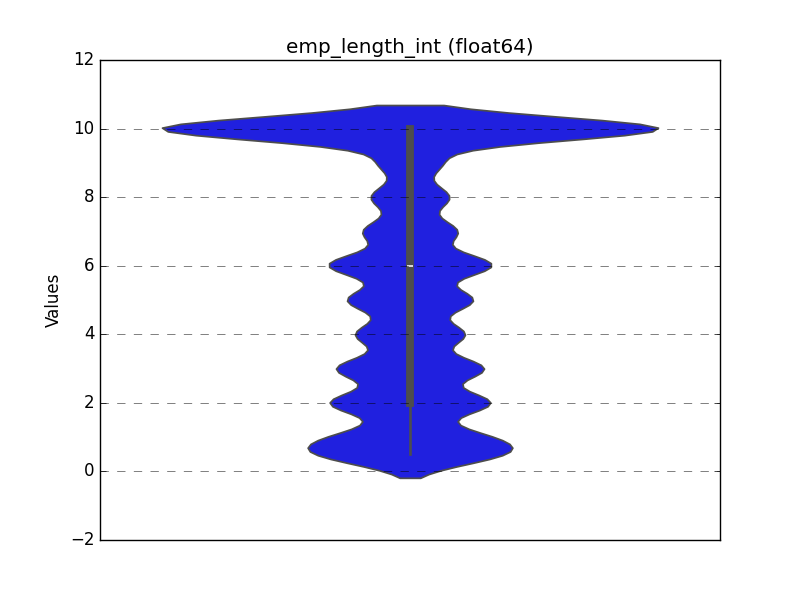
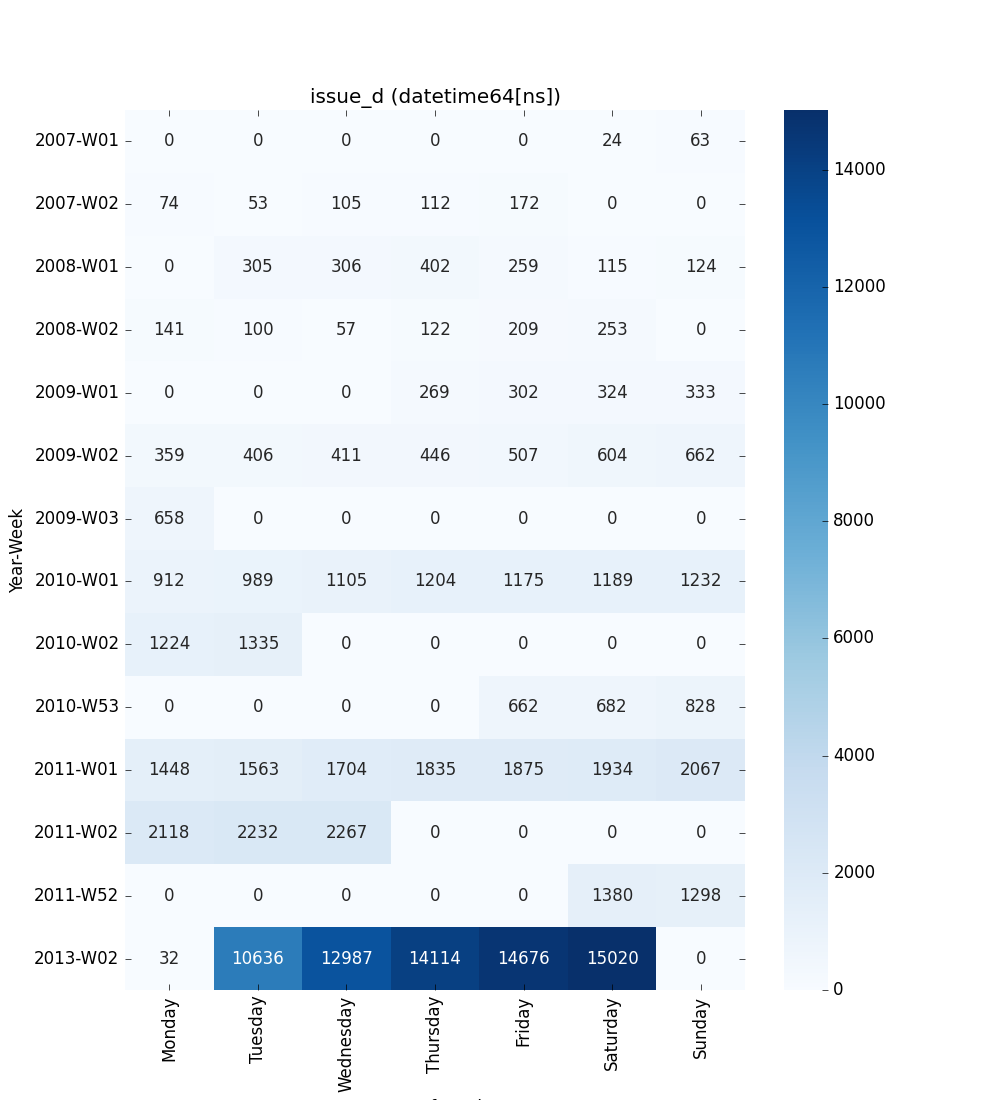
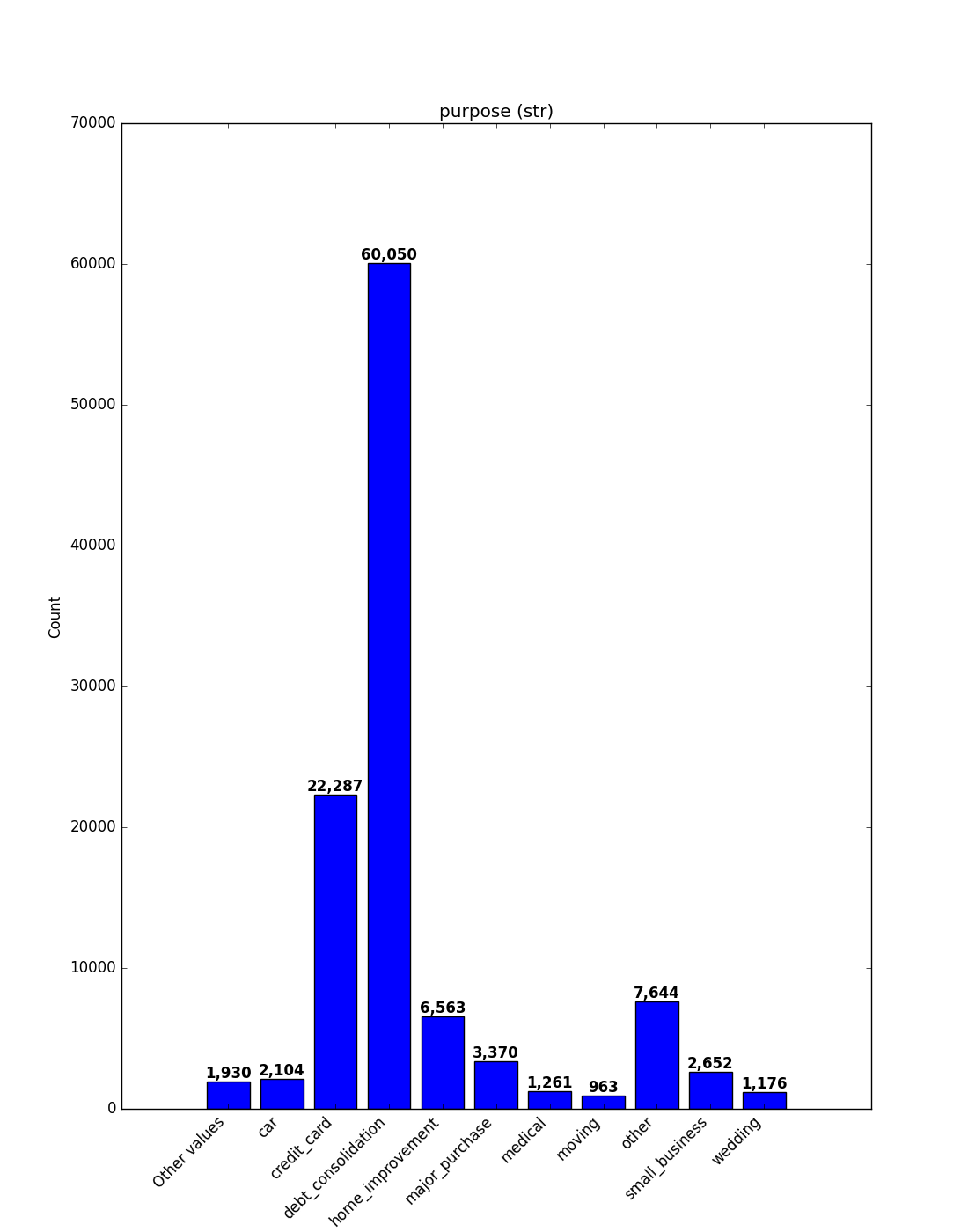
For each different type of feature a different graph will be generated:
Float
A violin plot is shown:
Datetime Series
Datetime features are visualized as a 2-D heatmap that shows weekly patterns:
X-axis - Day of the week (configurable first day via
first_day_of_week)Y-axis - Year-week (e.g.,
2024-W52,2025-W01)Cell values - Count of records for that day/week (numbers are annotated)
Default (week starts on Monday):
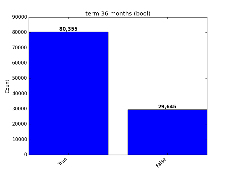
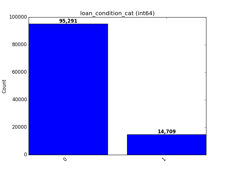
Object, Categorical, Boolean or Integer
A count plot is shown.
Categorical / Object
If the categorical / object feature has more than 10 unique values, the 10 most common
values are shown and the rest are labelled “Other Values”. Use the order parameter
to control sorting (e.g., "count_desc" or a list of category names).
Boolean
Integer
Visualize Correlations
This method provides a heatmap visualization of feature correlations. Use this when you want to:
Get an overview of relationships between all features in your dataset
Identify clusters of highly correlated features
Spot potential redundancies in your feature set
This visualization can guide feature selection, help in understanding feature interactions, and inform feature engineering strategies.
- ds_utils.preprocess.visualization.visualize_correlations(correlation_matrix: DataFrame, *, ax: Axes | None = None, **kwargs) Axes[source]
Compute and visualize pairwise correlations of columns, excluding NA/null values.
- Parameters:
correlation_matrix – The correlation matrix.
ax – Axes in which to draw the plot. If None, use the currently active Axes.
kwargs – Additional keyword arguments passed to seaborn’s heatmap function.
- Returns:
The Axes object with the plot drawn onto it.
Code Example
For this example, a dummy dataset was created. You can find the data in the resources directory in the package’s tests folder.
Here’s how to use the code:
import pandas as pd
from matplotlib import pyplot as plt
from ds_utils.preprocess.visualization import visualize_correlations

data_1M = pd.read_csv('path/to/dataset')
visualize_correlations(data_1M.corr())
plt.show()
The following image will be shown:

Plot Correlation Dendrogram
This method creates a hierarchical clustering of features based on their correlations. Use this when you want to:
Visualize the hierarchical structure of feature relationships
Identify groups of features that are closely related
Guide feature selection by choosing representatives from each cluster
This visualization is particularly useful for high-dimensional datasets, helping to simplify complex feature spaces and inform dimensionality reduction strategies.
- ds_utils.preprocess.visualization.plot_correlation_dendrogram(correlation_matrix: DataFrame, cluster_distance_method: str | Callable = 'average', *, ax: Axes | None = None, **kwargs) Axes[source]
Plot a dendrogram of the correlation matrix, showing hierarchically the most correlated variables.
- Parameters:
correlation_matrix – The correlation matrix.
cluster_distance_method – Method for calculating the distance between newly formed clusters. Read more here
ax – Axes in which to draw the plot. If None, use the currently active Axes.
kwargs – Additional keyword arguments passed to the dendrogram function.
- Returns:
The Axes object with the plot drawn onto it.
Code Example
For this example, a dummy dataset was created. You can find the data in the resources directory in the package’s tests folder.
Here’s how to use the code:
import pandas as pd
from matplotlib import pyplot as plt
from ds_utils.preprocess.visualization import plot_correlation_dendrogram

data_1M = pd.read_csv('path/to/dataset')
plot_correlation_dendrogram(data_1M.corr())
plt.show()
The following image will be shown:

Plot Features’ Interaction
This method visualizes the relationship between two features. Use this when you want to:
Understand how two features interact or relate to each other
Identify potential non-linear relationships between features
Detect patterns, clusters, or outliers in feature pairs
Handling Missing Values
By default (remove_na=False), the function visualizes missing values (NaNs/NaTs) to prevent data loss in the visual analysis:
Numeric & Datetime: Missing values in one variable are plotted as rug marks or special markers along the axis of the valid variable. This allows you to see the distribution of the valid data even when the other variable is missing.
Categorical: Missing values are treated as a distinct category (e.g., “nan”).
These insights can guide feature engineering, help in identifying complex relationships that might be exploited by your model, and inform the choice of model type (e.g., linear vs. non-linear).
- ds_utils.preprocess.visualization.plot_features_interaction(data: DataFrame, feature_1: str, feature_2: str, *, remove_na: bool = False, include_outliers: bool = True, outlier_iqr_multiplier: float = 1.5, show_ratios: bool = False, ax: Axes | None = None, **kwargs) Axes[source]
Plot the joint distribution between two features using type-aware defaults.
Behavior by dtypes of
feature_1andfeature_2: - If both are numeric: scatter plot. - If one is datetime and the other numeric: line/scatter over time. - If both are datetime: scatter plot with complete cases. - If both are categorical-like: overlaid histograms per category. - If one is categorical-like and the other numeric: violin plot by category.For the categorical-vs-numeric case, you can optionally trim outliers from the numeric feature using an IQR fence [Q1 - k*IQR, Q3 + k*IQR], where
kis controlled byoutlier_iqr_multiplier.When
remove_nais False, missing values are visualized:Numeric vs Numeric: marginal rug plots showing missing values
Numeric vs Datetime: missing numeric values shown as markers on x-axis, missing datetime values shown as rug plot on right margin
Datetime vs Datetime: complete cases shown as scatter plot, missing values shown as rug plots on margins (x-axis for missing feature_2, y-axis for missing feature_1)
Categorical vs Numeric: missing numeric values shown with rug plots per category
Categorical vs Categorical: missing values included as “Missing” category
Categorical/Boolean vs Datetime: missing categorical values added as “Missing” category, missing datetime values shown as a separate violin at the edge of the plot
- Parameters:
data – The input DataFrame where each feature is a column.
feature_1 – Name of the first feature.
feature_2 – Name of the second feature.
remove_na – If False (default), keep all data and visualize missingness patterns. If True, remove rows where either feature is NA before plotting.
include_outliers – Whether to include values outside the IQR fence for categorical-vs-numeric violin plots (default True).
outlier_iqr_multiplier – Multiplier
kfor the IQR fence when trimming outliers in categorical-vs-numeric plots (default 1.5).show_ratios – If True, display ratios (proportions) instead of absolute counts for categorical vs categorical plots. Only applies when both features are categorical-like (default False).
ax – Axes in which to draw the plot. If None, a new one is created.
kwargs – Additional keyword arguments forwarded to the underlying plotting functions (e.g.,
seaborn.violinplot,Axes.scatter,Axes.plot).
- Returns:
The Axes object with the plot drawn onto it.
Code Example
For this example, a dummy dataset was created. You can find the data in the resources directory in the package’s tests folder.
Here’s how to use the code:
import pandas as pd
from matplotlib import pyplot as plt
from ds_utils.preprocess.visualization import plot_features_interaction

data_1M = pd.read_csv('path/to/dataset')
plot_features_interaction(data_1M, "x7", "x10")
plt.show()
For each different combination of feature types, a different plot will be shown:
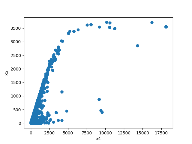
Both Features are Numeric
A scatter plot of the shared distribution is shown:
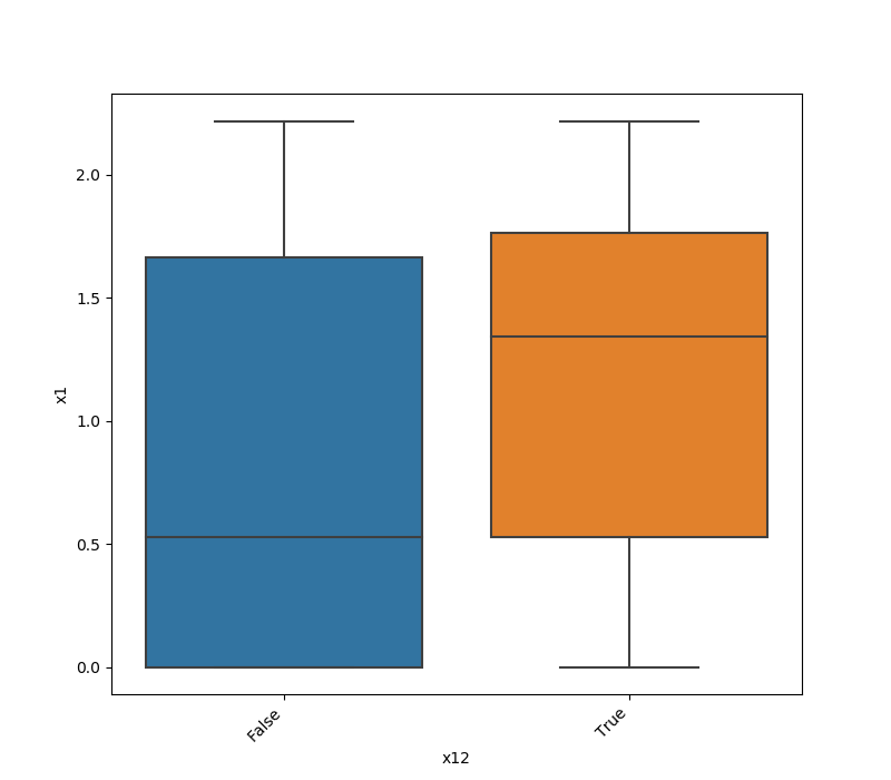
One Feature is Numeric and The Other is Categorical
If one feature is numeric and the other is either an object, a category, or a bool, then a violin plot
is shown. A violin plot combines a box plot with a kernel density estimate, displaying the distribution of the numeric feature for each unique value of the categorical feature. If the categorical feature has more than 10 unique values, then the 10 most common values are shown, and
the others are labeled “Other Values”.
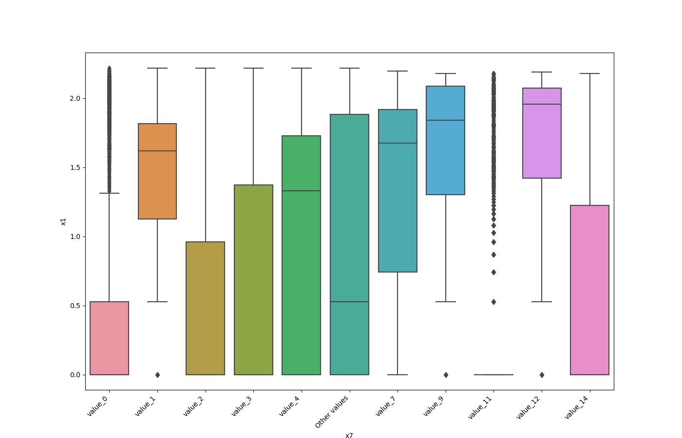
Here is an example for a boolean feature plot:
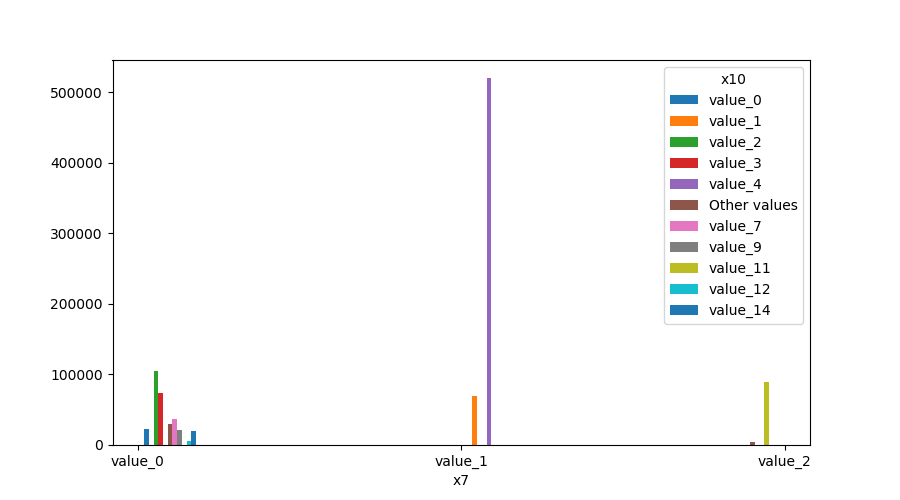
Both Features are Categorical
A shared histogram will be shown. If one or both features have more than 10 unique values, then the 10 most common values are shown, and the others are labeled “Other Values”.
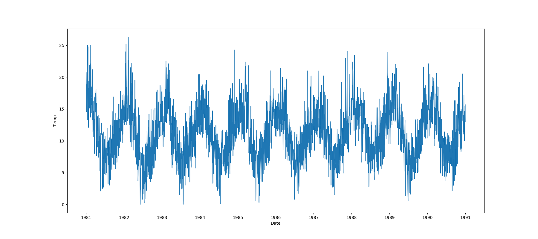
One Feature is Datetime Series and the Other is Numeric or Datetime Series
A line plot where the datetime series is on the x-axis is shown:
One Feature is Datetime Series and the Other is Categorical
If one feature is a datetime series and the other is either an object, a category, or a bool, then a
violin plot is shown. A violin plot is a combination of a boxplot and a kernel density estimate. If the categorical feature
has more than 10 unique values, then the 10 most common values are shown, and the others are labeled “Other Values”. The
datetime series will be on the x-axis:
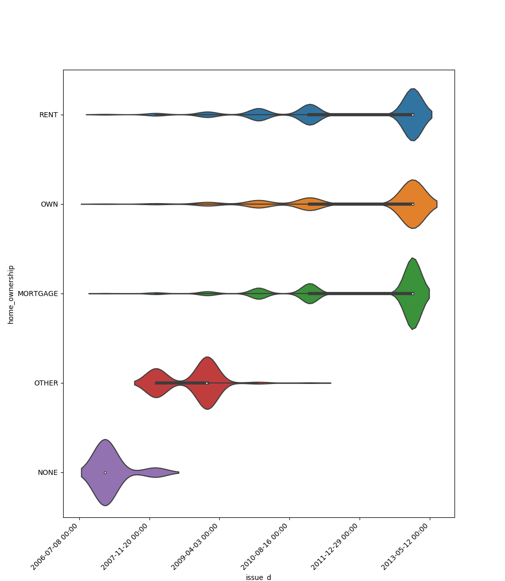
Here is an example for a boolean feature plot:

Choosing the Right Visualization
Use visualize_feature for a quick overview of individual features.
Use get_correlated_features and visualize_correlations to understand relationships between multiple features.
Use plot_correlation_dendrogram for a hierarchical view of feature relationships, especially useful for high-dimensional data.
Use plot_features_interaction to deep dive into the relationship between specific feature pairs.
Use plot_pca_explained_variance to determine how many principal components are required to capture a desired proportion of variance.
By combining these visualizations, you can gain a comprehensive understanding of your dataset’s structure, which is crucial for effective data preprocessing, feature engineering, and model selection.
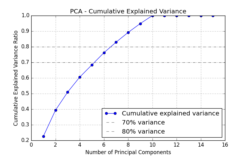
Plot PCA Explained Variance
This method visualizes the cumulative explained variance ratio of PCA components. Use this when you want to:
Determine how many principal components are required to capture a desired proportion of the total variance in the data.
Perform dimensionality reduction using PCA.
Understand how variance is distributed across the components.
- ds_utils.preprocess.visualization.plot_pca_explained_variance(X: DataFrame, use_scaling: bool = True, scaler: TransformerMixin | None = None, legend_loc: str = 'lower right', ax: Axes | None = None, pca_kwargs: dict | None = None, **kwargs) Axes[source]
Plot the cumulative explained variance ratio of PCA components.
This visualization helps determine how many principal components are needed to capture a desired proportion of the total variance in the data. Horizontal reference lines are drawn at 70% and 80% variance.
- Parameters:
X – Input data with numerical features (rows = samples, columns = features).
use_scaling – If True, scale the data using the provided scaler before fitting PCA.
scaler – Scaler instance to use when use_scaling is True. If None, StandardScaler is used.
legend_loc – Location of the legend. Default is “lower right”.
ax – Matplotlib Axes to draw the plot on. If None, a new figure and Axes are created.
pca_kwargs – Additional keyword arguments passed directly to sklearn.decomposition.PCA (e.g.,
pca_kwargs={"n_components": 5}). If None, PCA is initialized with its defaults.kwargs – Additional keyword arguments passed to axes.plot.
- Returns:
The Axes object containing the plot.
- Raises:
ValueError – If any column in X is non-numeric.
Code Example
Here’s how to use the code:
import pandas as pd
from matplotlib import pyplot as plt
from ds_utils.preprocess.visualization import plot_pca_explained_variance

data = pd.read_csv('path/to/dataset')
# Use only numeric features
numeric_data = data.select_dtypes(include="number")

plot_pca_explained_variance(numeric_data, use_scaling=True)
plt.show()
The plot displays the cumulative variance ratio as a line graph, with horizontal reference lines at 70% and 80% variance.