Metrics
The module of metrics contains methods that help to calculate and/or visualize evaluation performance of an algorithm.
Plot Confusion Matrix
- metrics.plot_confusion_matrix(y_test: ndarray, y_pred: ndarray, labels: List[str | int], sample_weight: List[float] | None = None, annot_kws: Dict | None = None, cbar: bool = True, cbar_kws: Dict | None = None, **kwargs) Axes[source]
Compute and plot confusion matrix with classification metrics.
Computes and plots confusion matrix, False Positive Rate, False Negative Rate, Accuracy, and F1 score of a classification.
- Parameters:
y_test – array, shape = [n_samples]. Ground truth (correct) target values.
y_pred – array, shape = [n_samples]. Estimated targets as returned by a classifier.
labels – List of labels (strings or integers) used to index the matrix, corresponding to n_classes.
sample_weight – array-like of shape = [n_samples], optional. Optional sample weights for weighting the samples.
annot_kws – dict of key, value mappings, optional. Keyword arguments for
ax.text.cbar – boolean, optional. Whether to draw a colorbar.
cbar_kws – dict of key, value mappings, optional. Keyword arguments for
figure.colorbar.kwargs – other keyword arguments. All other keyword arguments are passed to
matplotlib.axes.Axes.pcolormesh().
- Returns:
Returns the Axes object with the matrix drawn onto it.
- Raises:
ValueError – If number of labels is lower than 2.
Code Examples
In the following examples, we are going to use the iris dataset from scikit-learn. First, let’s import it:
import numpy as np
from sklearn import datasets

IRIS = datasets.load_iris()
RANDOM_STATE = np.random.RandomState(0)
Next, we’ll add a small function to add noise:
def _add_noisy_features(x, random_state):
    n_samples, n_features = x.shape
    return numpy.c_[x, random_state.randn(n_samples, 200 * n_features)]
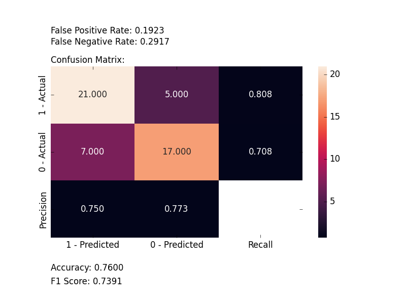
Binary Classification
We’ll use only the first two classes in the iris dataset, build an SVM classifier and evaluate it:
from matplotlib import pyplot as plt
from sklearn.model_selection import train_test_split
from sklearn import svm

from ds_utils.metrics import plot_confusion_matrix

# Load and prepare the data
features = IRIS.data
labels = IRIS.target

# Add noisy features to make the problem harder
features = _add_noisy_features(features, RANDOM_STATE)

# Limit to the two first classes, and split into training and test
X_train, X_test, y_train, y_test = train_test_split(features[labels < 2], labels[labels < 2],
                                                    test_size=.5, random_state=RANDOM_STATE)

# Create a simple classifier
classifier = svm.LinearSVC(random_state=RANDOM_STATE)
classifier.fit(X_train, y_train)
y_pred = classifier.predict(X_test)

plot_confusion_matrix(y_test, y_pred, [1, 0])

plt.show()
And the following image will be shown:
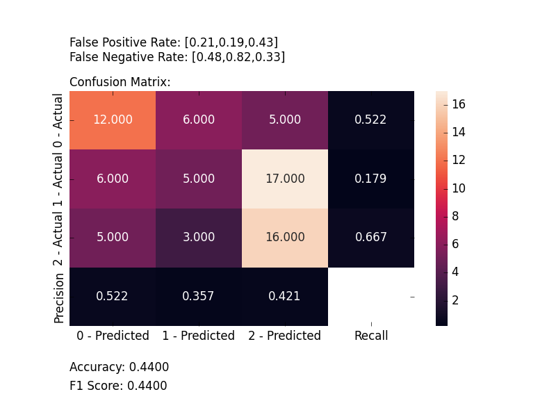
Multi-Label Classification
This time, we’ll train on all the classes and plot an evaluation:
from matplotlib import pyplot as plt
from sklearn.model_selection import train_test_split
from sklearn.multiclass import OneVsRestClassifier
from sklearn import svm

from ds_utils.metrics import plot_confusion_matrix

# Load and prepare the data
features = IRIS.data
labels = IRIS.target

# Add noisy features to make the problem harder
features = _add_noisy_features(features, RANDOM_STATE)

X_train, X_test, y_train, y_test = train_test_split(features, labels, test_size=.5, random_state=RANDOM_STATE)

# Create a simple classifier
# OneVsRestClassifier is used for multi-class classification
classifier = OneVsRestClassifier(svm.LinearSVC(random_state=RANDOM_STATE))
classifier.fit(X_train, y_train)
y_pred = classifier.predict(X_test)

plot_confusion_matrix(y_test, y_pred, [0, 1, 2])
plt.show()
And the following image will be shown:
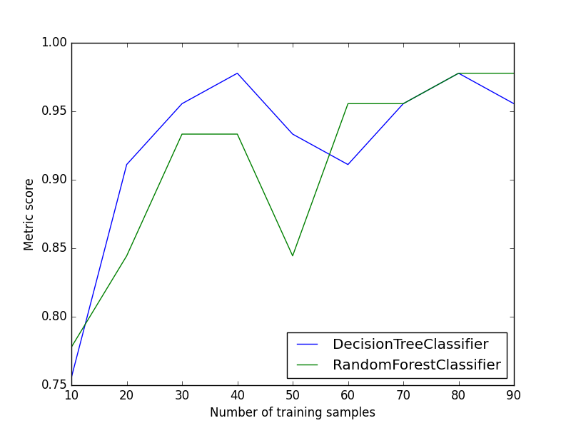
Plot Metric Growth per Labeled Instances
- metrics.plot_metric_growth_per_labeled_instances(X_train: ~numpy.ndarray, y_train: ~numpy.ndarray, X_test: ~numpy.ndarray, y_test: ~numpy.ndarray, classifiers_dict: ~typing.Dict[str, ~sklearn.base.ClassifierMixin], n_samples: ~typing.List[int] | None = None, quantiles: ~typing.List[float] | None = [0.05, 0.1, 0.15, 0.2, 0.25, 0.3, 0.35, 0.39999999999999997, 0.44999999999999996, 0.49999999999999994, 0.5499999999999999, 0.6, 0.65, 0.7, 0.75, 0.7999999999999999, 0.85, 0.9, 0.95, 1.0], metric: ~typing.Callable[[~numpy.ndarray, ~numpy.ndarray], float] = <function accuracy_score>, random_state: int | ~numpy.random.mtrand.RandomState | None = None, n_jobs: int | None = None, verbose: int = 0, pre_dispatch: int | str | None = '2*n_jobs', *, ax: ~matplotlib.axes._axes.Axes | None = None, **kwargs) Axes[source]
Plot learning curves showing metric performance vs. training set size.
Receives train and test sets, and plots the change in the given metric with increasing numbers of trained instances.
- Parameters:
X_train – array-like or sparse matrix of shape (n_samples, n_features). The training input samples.
y_train – array-like of shape (n_samples,). The target values (class labels) as integers or strings.
X_test – array-like or sparse matrix of shape (n_samples, n_features). The test or evaluation input samples.
y_test – array-like of shape (n_samples,). The true labels for X_test.
classifiers_dict – mapping from classifier name to a classifier object.
n_samples – List of numbers of samples for training batches, optional (default=None).
quantiles – List of sample percentages for training batches, optional (default=[0.05, 0.1, …, 0.95, 1]). Used when n_samples=None.
metric – sklearn.metrics API function which receives y_true and y_pred and returns float.
random_state – int, RandomState instance or None, optional (default=None). Controls the shuffling applied to the data before applying the split.
n_jobs – int or None, optional (default=None). The number of jobs to run in parallel.
verbose – int, optional (default=0). Controls the verbosity when fitting and predicting.
pre_dispatch – int or string, optional. Controls the number of jobs that get dispatched during parallel execution.
ax – matplotlib Axes object, optional. The axes to plot on.
kwargs – additional keyword arguments to be passed to the plot function.
- Returns:
The Axes object with the plot drawn onto it.
- Raises:
ValueError – If both n_samples and quantiles are None.
Code Example
In this example, we’ll divide the data into train and test sets, decide on which classifiers we want to measure, and plot the results:
from matplotlib import pyplot as plt
from sklearn.ensemble import RandomForestClassifier
from sklearn.model_selection import train_test_split
from sklearn.tree import DecisionTreeClassifier

from ds_utils.metrics import plot_metric_growth_per_labeled_instances

# Load and prepare the data
features = IRIS.data
labels = IRIS.target

X_train, X_test, y_train, y_test = train_test_split(features, labels, test_size=.3, random_state=0)

# Define classifiers to compare
classifiers = {
    "DecisionTreeClassifier": DecisionTreeClassifier(random_state=0),
    "RandomForestClassifier": RandomForestClassifier(random_state=0, n_estimators=5)
}

# Plot metric growth for different amounts of training data
plot_metric_growth_per_labeled_instances(X_train, y_train, X_test, y_test, classifiers)
plt.show()
And the following image will be shown:
Visualize Accuracy Grouped by Probability
This method was created due to the lack of maintenance of the package EthicalML / xai.
- metrics.visualize_accuracy_grouped_by_probability(y_test: ndarray, labeled_class: str | int, probabilities: ndarray, threshold: float = 0.5, display_breakdown: bool = False, bins: int | Sequence[float] | IntervalIndex | None = None, *, ax: Axes | None = None, **kwargs) Axes[source]
Plot a stacked bar chart of classifier results by probability bins.
Receives true test labels and classifier probability predictions, divides and classifies the results, and finally plots a stacked bar chart with the results. Original code.
- Parameters:
y_test – array, shape = [n_samples]. Ground truth (correct) target values.
labeled_class – the class to inquire about.
probabilities – array, shape = [n_samples]. Classifier probabilities for the labeled class.
threshold – the probability threshold for classifying the labeled class.
display_breakdown – if True, the results will be displayed as “correct” and “incorrect”; otherwise as “true-positives”, “true-negatives”, “false-positives” and “false-negatives”.
bins – int, sequence of scalars, or IntervalIndex. The criteria to bin by.
ax – matplotlib Axes object, optional. The axes to plot on.
kwargs – additional keyword arguments to be passed to the plot function.
- Returns:
The Axes object with the plot drawn onto it.
Code Example
The example uses a small sample from a dataset from kaggle, which a dummy bank provides loans.
Let’s see how to use the code:
from matplotlib import pyplot as plt
from sklearn.ensemble import RandomForestClassifier
from ds_utils.metrics import visualize_accuracy_grouped_by_probability
# Load and prepare the data
loan_data = pandas.read_csv(path/to/dataset, encoding="latin1", nrows=11000,
parse_dates=["issue_d"])
loan_data = loan_data.drop(["id", "application_type"], axis=1)
loan_data = loan_data.sort_values("issue_d")
loan_data = pandas.get_dummies(loan_data)
# Prepare train and test sets
train = (loan_data.head(int(loan_data.shape[0] * 0.7))
.sample(frac=1)
.reset_index(drop=True)
.drop("issue_d", axis=1))
test = loan_data.tail(int(loan_data.shape[0] * 0.3)).drop("issue_d", axis=1)
# Define features to use for classification
selected_features = [
'emp_length_int', 'home_ownership_MORTGAGE', 'home_ownership_RENT',
'income_category_Low', 'term_ 36 months', 'purpose_debt_consolidation',
'purpose_small_business', 'interest_payments_High'
]
# Train the classifier
classifier = RandomForestClassifier(
min_samples_leaf=int(train.shape[0] * 0.01),
class_weight="balanced",
n_estimators=1000,
random_state=0
)
classifier.fit(train[selected_features], train["loan_condition_cat"])
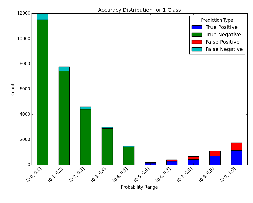
# Make predictions and visualize accuracy
probabilities = classifier.predict_proba(test[selected_features])
visualize_accuracy_grouped_by_probability(
test["loan_condition_cat"],
1,
probabilities[:, 1],
display_breakdown=False
)
plt.show()
And the following image will be shown:
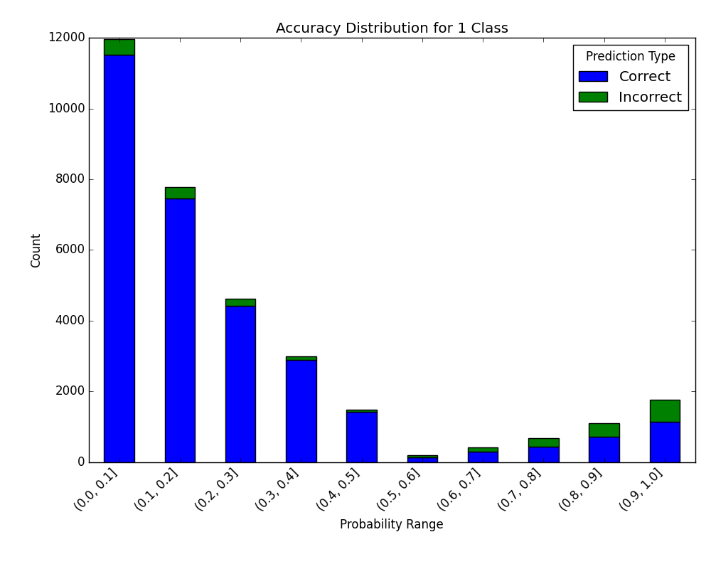
If we choose to display the breakdown:
visualize_accuracy_grouped_by_probability(
    test["loan_condition_cat"],
    1,
    probabilities[:, 1],
    display_breakdown=True
)
plt.show()
And the following image will be shown:
Receiver Operating Characteristic (ROC) Curve with Probabilities (Thresholds) Annotations
The ROC curve is a graphical plot that illustrates the diagnostic ability of a binary classifier system as its discrimination threshold is varied. It plots the True Positive Rate (TPR) against the False Positive Rate (FPR) at various threshold settings. The ROC curve is particularly useful when you have balanced classes or when you want to evaluate the classifier’s performance across all possible thresholds.
- metrics.plot_roc_curve_with_thresholds_annotations(y_true: ndarray, classifiers_names_and_scores_dict: Dict[str, ndarray], *, positive_label: int | float | bool | str | None = None, sample_weight: ndarray | None = None, drop_intermediate: bool = True, average: str | None = 'macro', max_fpr: float | None = None, multi_class: str = 'raise', labels: ndarray | None = None, fig: Figure | None = None, mode: str | None = 'lines+markers', add_random_classifier_line: bool = True, show_legend: bool = True, **kwargs) Figure[source]
Plot ROC curves with threshold annotations for multiple classifiers.
- Parameters:
y_true – array-like of shape (n_samples,). True binary labels.
classifiers_names_and_scores_dict – mapping from classifier name to classifier’s score.
positive_label – int, float, bool or str, default=None. The label of the positive class.
sample_weight – array-like of shape (n_samples,), default=None. Sample weights.
drop_intermediate – bool, default=True. Whether to drop some suboptimal thresholds that would not appear on a plotted ROC curve.
average – {‘micro’, ‘macro’, ‘samples’, ‘weighted’} or None, default=’macro’. If not None, this determines the type of averaging performed on the data.
max_fpr – float > 0 and <= 1, default=None. If not None, the standardized partial AUC over the range [0, max_fpr] is returned.
multi_class – {‘raise’, ‘ovr’, ‘ovo’}, default=’raise’. Determines the type of configuration to use for multiclass targets.
labels – array-like of shape (n_classes,), default=None. Only used for multiclass targets. List of labels that index the classes in y_score.
fig – plotly’s Figure object, optional. The figure to plot on.
mode – str, default=’lines+markers’. Determines the drawing mode for this scatter trace.
add_random_classifier_line – bool, default=True. Whether to plot a diagonal dashed black line which represents a random classifier.
show_legend – bool, default=True. Whether to display legend in the plot.
kwargs – additional keyword arguments to be passed to the plot function.
- Returns:
The Figure object with the plot drawn onto it.
- Raises:
ValueError – If the input data is invalid or inconsistent.
Code Example
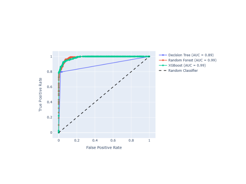
Suppose that we want to compare 3 classifiers based on ROC Curve and optimize the prediction threshold. The method uses Plotly as the backend engine to create the graphs and adds the AUC score next to each classifier name:
from sklearn.tree import DecisionTreeClassifier
from sklearn.ensemble import RandomForestClassifier
from xgboost import XGBClassifier

from ds_utils.metrics import plot_roc_curve_with_thresholds_annotations

# Define and train classifiers
tree_clf = DecisionTreeClassifier(random_state=42)
rf_clf = RandomForestClassifier(random_state=42)
xgb_clf = XGBClassifier(random_state=42, eval_metric='logloss')

tree_clf.fit(X_train, y_train)
rf_clf.fit(X_train, y_train)
xgb_clf.fit(X_train, y_train)

# Prepare classifier predictions
classifiers_names_and_scores_dict = {
    "Decision Tree": tree_clf.predict_proba(X_test)[:, 1],
    "Random Forest": rf_clf.predict_proba(X_test)[:, 1],
    "XGBoost": xgb_clf.predict_proba(X_test)[:, 1]
}

# Plot ROC curves
fig = plot_roc_curve_with_thresholds_annotations(
    y_test,
    classifiers_names_and_scores_dict,
    positive_label=1
)
fig.show()
The positive_label=1 parameter specifies which class should be considered as the positive class when calculating the ROC curve. In this case, it indicates that the class labeled as ‘1’ is the positive class.
And the following interactive graph will be shown:
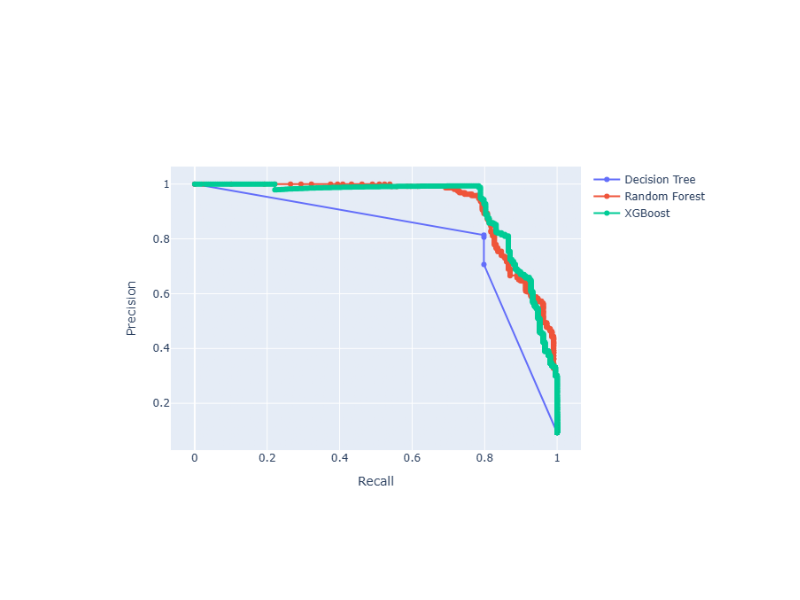
Precision-Recall Curve with Probabilities (Thresholds) Annotations
The Precision-Recall curve shows the tradeoff between precision and recall for different threshold values. It is particularly useful when you have imbalanced classes, as it focuses on the performance of the positive class. Precision-Recall curves are preferred over ROC curves when you have a large skew in the class distribution, as they are more sensitive to differences in the minority class.
- metrics.plot_precision_recall_curve_with_thresholds_annotations(y_true: ndarray, classifiers_names_and_scores_dict: Dict[str, ndarray], *, positive_label: int | float | bool | str | None = None, sample_weight: ndarray | None = None, drop_intermediate: bool = True, fig: Figure | None = None, mode: str | None = 'lines+markers', add_random_classifier_line: bool = False, show_legend: bool = True, **kwargs) Figure[source]
Plot Precision-Recall curves with threshold annotations for multiple classifiers.
- Parameters:
y_true – array-like of shape (n_samples,). True binary labels.
classifiers_names_and_scores_dict – mapping from classifier name to classifier’s score.
positive_label – int, float, bool or str, default=None. The label of the positive class.
sample_weight – array-like of shape (n_samples,), default=None. Sample weights.
drop_intermediate – bool, default=True. Whether to drop some suboptimal thresholds that would not appear on a plotted Precision-Recall curve.
fig – plotly’s Figure object, optional. The figure to plot on.
mode – str, default=’lines+markers’. Determines the drawing mode for this scatter trace.
add_random_classifier_line – bool, default=False. Whether to plot a diagonal dashed black line which represents a random classifier.
show_legend – bool, default=True. Whether to display legend in the plot.
kwargs – additional keyword arguments to be passed to the plot function.
- Returns:
The Figure object with the plot drawn onto it.
- Raises:
ValueError – If the input data is invalid or inconsistent.
Code Example
Suppose that we want to compare 3 classifiers based on Precision-Recall Curve and optimize the prediction threshold. The method uses Plotly as the backend engine to create the graphs:
from sklearn.tree import DecisionTreeClassifier
from sklearn.ensemble import RandomForestClassifier
from xgboost import XGBClassifier

from ds_utils.metrics import plot_precision_recall_curve_with_thresholds_annotations

# Define and train classifiers
tree_clf = DecisionTreeClassifier(random_state=42)
rf_clf = RandomForestClassifier(random_state=42)
xgb_clf = XGBClassifier(random_state=42, eval_metric='logloss')

tree_clf.fit(X_train, y_train)
rf_clf.fit(X_train, y_train)
xgb_clf.fit(X_train, y_train)

# Prepare classifier predictions
classifiers_names_and_scores_dict = {
    "Decision Tree": tree_clf.predict_proba(X_test)[:, 1],
    "Random Forest": rf_clf.predict_proba(X_test)[:, 1],
    "XGBoost": xgb_clf.predict_proba(X_test)[:, 1]
}

# Plot Precision-Recall curves
fig = plot_precision_recall_curve_with_thresholds_annotations(
    y_test,
    classifiers_names_and_scores_dict,
    positive_label=1
)
fig.show()
Similar to the ROC curve example, the positive_label=1 parameter here specifies that the class labeled as ‘1’ should be considered as the positive class when calculating the Precision-Recall curve.
And the following interactive graph will be shown: