Preprocess
The preprocess module contains methods for data preprocessing before training. These visualization tools help in understanding the structure and relationships within your data, which is crucial for effective feature engineering and model selection.
Visualize Feature
This method provides a quick visualization of individual features, offering insights into their distribution and characteristics. Use this when you want to:
Understand the distribution of numerical features
Identify the most common categories in categorical features
Observe trends in time series data
Detect potential outliers or unusual patterns
These insights can guide feature engineering, help in identifying data quality issues, and inform the choice of preprocessing steps or model types.
- preprocess.visualize_feature(series: Series, remove_na: bool = False, *, include_outliers: bool = True, outlier_iqr_multiplier: float = 1.5, ax: Axes | None = None, **kwargs) Axes[source]
Visualize a pandas Series using an appropriate plot based on dtype.
Behavior by dtype: - Float: draw a violin distribution. If
include_outliersis False, valuesoutside the IQR fence [Q1 - k*IQR, Q3 + k*IQR] with
k=outlier_iqr_multiplierare trimmed prior to plotting.Datetime: draw a line plot of value counts over time (sorted by index).
Object/categorical/bool/int: draw a count plot. Extremely high-cardinality series may be reduced to their top categories internally.
- Parameters:
series – The data series to visualize.
remove_na – If True, plot with NA values removed; otherwise include them.
include_outliers – Whether to include outliers for float features.
outlier_iqr_multiplier – IQR multiplier used to trim outliers for float features.
ax – Axes in which to draw the plot. If None, a new one is created.
kwargs – Extra keyword arguments forwarded to the underlying plotting function (
seaborn.violinplot,Series.plot, orseaborn.countplot).
- Returns:
The Axes object with the plot drawn onto it.
Code Example
This example uses a small sample from a dataset available on Kaggle, which contains loan data from a dummy bank.
Here’s how to use the code:
import pandas as pd
from matplotlib import pyplot as plt
from ds_utils.preprocess import visualize_feature

loan_frame = pd.read_csv('path/to/dataset', encoding="latin1", nrows=11000, parse_dates=["issue_d"])
loan_frame = loan_frame.drop("id", axis=1)

visualize_feature(loan_frame["some_feature"])

plt.show()
For each different type of feature, a different graph will be generated:
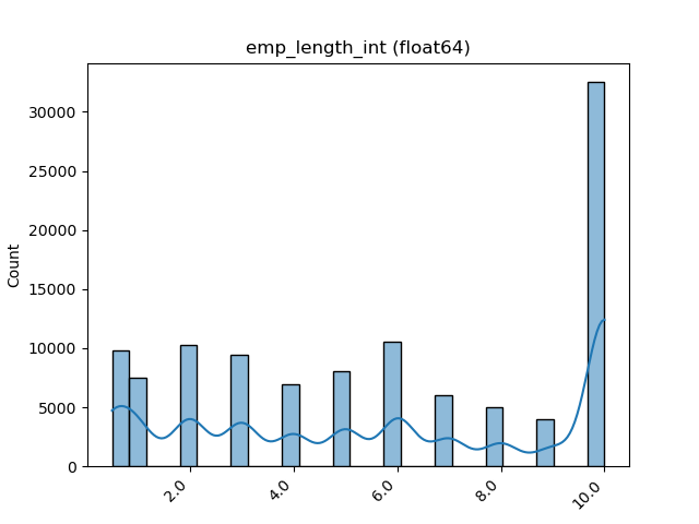
Float
A violin plot is shown:
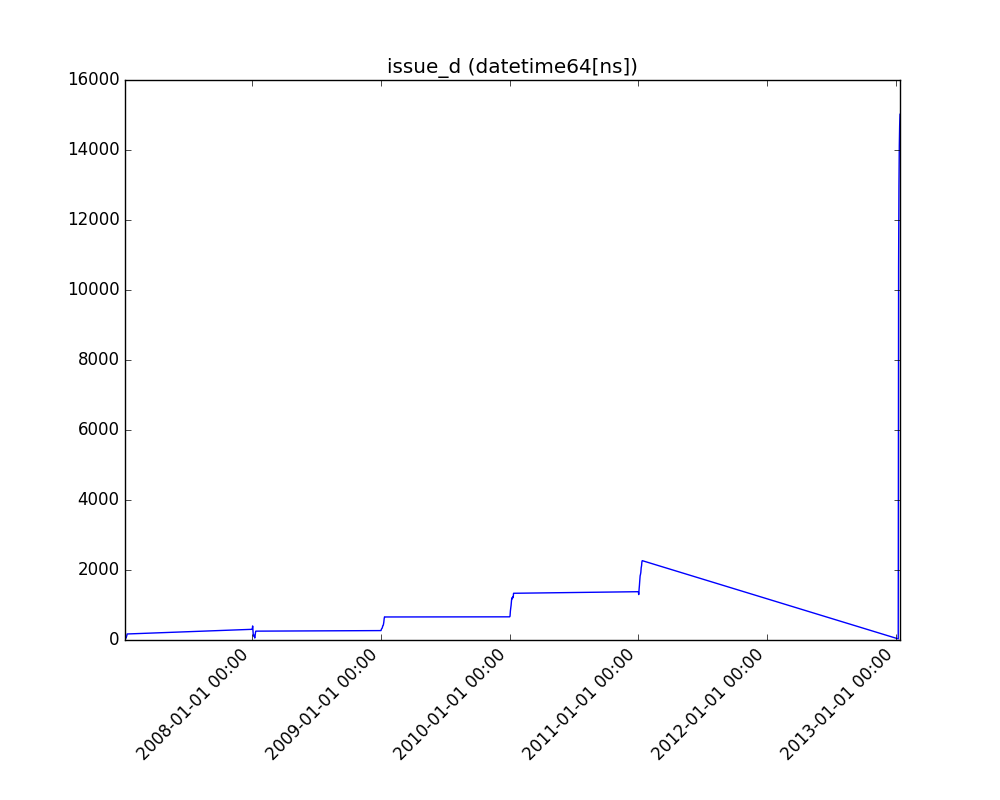
Datetime Series
A line plot is shown:
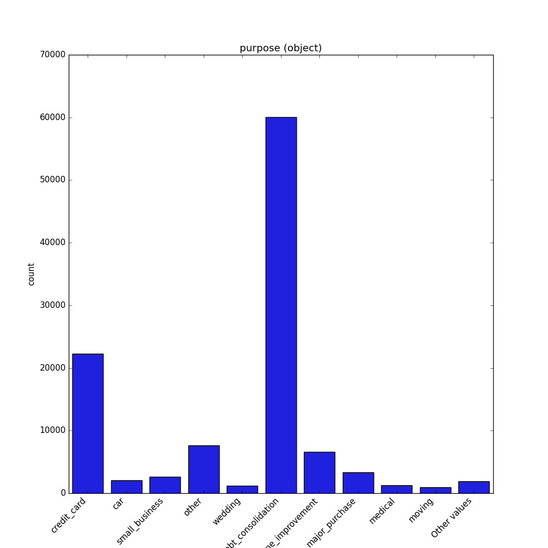
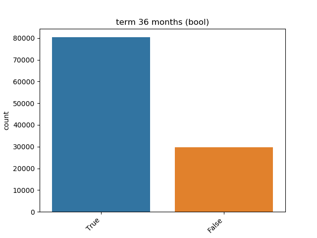
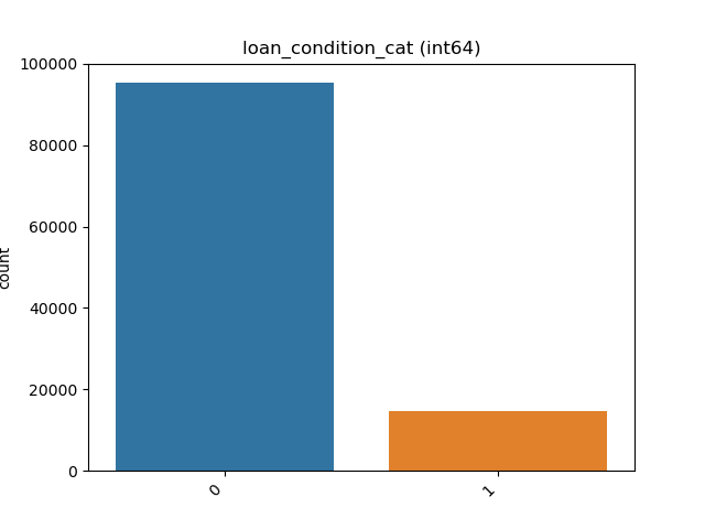
Object, Categorical, Boolean or Integer
A count plot is shown.
Categorical / Object:
If the categorical / object feature has more than 10 unique values, the 10 most common values are shown, and the others are labeled “Other Values”.
Boolean:
Integer:
Visualize Correlations
This method provides a heatmap visualization of feature correlations. Use this when you want to:
Get an overview of relationships between all features in your dataset
Identify clusters of highly correlated features
Spot potential redundancies in your feature set
This visualization can guide feature selection, help in understanding feature interactions, and inform feature engineering strategies.
- preprocess.visualize_correlations(correlation_matrix: DataFrame, *, ax: Axes | None = None, **kwargs) Axes[source]
Compute and visualize pairwise correlations of columns, excluding NA/null values.
- Parameters:
correlation_matrix – The correlation matrix.
ax – Axes in which to draw the plot. If None, use the currently active Axes.
kwargs – Additional keyword arguments passed to seaborn’s heatmap function.
- Returns:
The Axes object with the plot drawn onto it.
Code Example
For this example, a dummy dataset was created. You can find the data in the resources directory in the package’s tests folder.
Here’s how to use the code:
import pandas as pd
from matplotlib import pyplot as plt
from ds_utils.preprocess import visualize_correlations

data_1M = pd.read_csv('path/to/dataset')
visualize_correlations(data_1M.corr())
plt.show()
The following image will be shown:

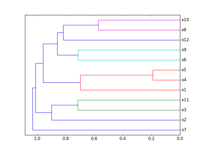
Plot Correlation Dendrogram
This method creates a hierarchical clustering of features based on their correlations. Use this when you want to:
Visualize the hierarchical structure of feature relationships
Identify groups of features that are closely related
Guide feature selection by choosing representatives from each cluster
This visualization is particularly useful for high-dimensional datasets, helping to simplify complex feature spaces and inform dimensionality reduction strategies.
- preprocess.plot_correlation_dendrogram(correlation_matrix: DataFrame, cluster_distance_method: str | Callable = 'average', *, ax: Axes | None = None, **kwargs) Axes[source]
Plot a dendrogram of the correlation matrix, showing hierarchically the most correlated variables.
- Parameters:
correlation_matrix – The correlation matrix.
cluster_distance_method – Method for calculating the distance between newly formed clusters. Read more here
ax – Axes in which to draw the plot. If None, use the currently active Axes.
kwargs – Additional keyword arguments passed to the dendrogram function.
- Returns:
The Axes object with the plot drawn onto it.
Code Example
For this example, a dummy dataset was created. You can find the data in the resources directory in the package’s tests folder.
Here’s how to use the code:
import pandas as pd
from matplotlib import pyplot as plt
from ds_utils.preprocess import plot_correlation_dendrogram

data_1M = pd.read_csv('path/to/dataset')
plot_correlation_dendrogram(data_1M.corr())
plt.show()
The following image will be shown:
Plot Features’ Interaction
This method visualizes the relationship between two features. Use this when you want to:
Understand how two features interact or relate to each other
Identify potential non-linear relationships between features
Detect patterns, clusters, or outliers in feature pairs
These insights can guide feature engineering, help in identifying complex relationships that might be exploited by your model, and inform the choice of model type (e.g., linear vs. non-linear).
- preprocess.plot_features_interaction(data: DataFrame, feature_1: str, feature_2: str, *, include_outliers: bool = True, outlier_iqr_multiplier: float = 1.5, ax: Axes | None = None, **kwargs) Axes[source]
Plot the joint distribution between two features using type-aware defaults.
Behavior by dtypes of
feature_1andfeature_2: - If both are numeric: scatter plot. - If one is datetime and the other numeric: line/scatter over time. - If both are categorical-like: overlaid histograms per category. - If one is categorical-like and the other numeric: violin plot by category.For the categorical-vs-numeric case, you can optionally trim outliers from the numeric feature using an IQR fence [Q1 - k*IQR, Q3 + k*IQR], where
kis controlled byoutlier_iqr_multiplier.- Parameters:
data – The input DataFrame where each feature is a column.
feature_1 – Name of the first feature.
feature_2 – Name of the second feature.
include_outliers – Whether to include values outside the IQR fence for categorical-vs-numeric violin plots (default True).
outlier_iqr_multiplier – Multiplier
kfor the IQR fence when trimming outliers in categorical-vs-numeric plots (default 1.5).ax – Axes in which to draw the plot. If None, a new one is created.
kwargs – Additional keyword arguments forwarded to the underlying plotting functions (e.g.,
seaborn.violinplot,Axes.scatter,Axes.plot).
- Returns:
The Axes object with the plot drawn onto it.
Code Example
For this example, a dummy dataset was created. You can find the data in the resources directory in the package’s tests folder.
Here’s how to use the code:
import pandas as pd
from matplotlib import pyplot as plt
from ds_utils.preprocess import plot_features_interaction

data_1M = pd.read_csv('path/to/dataset')
plot_features_interaction(data_1M, "x7", "x10")
plt.show()
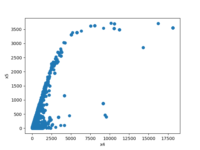
For each different combination of feature types, a different plot will be shown:
Both Features are Numeric
A scatter plot of the shared distribution is shown:
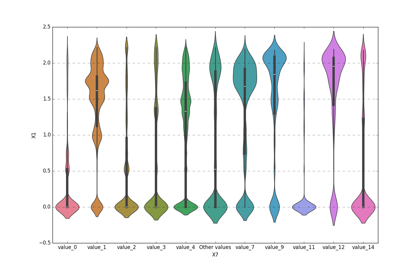
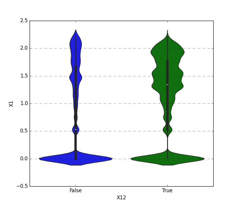
One Feature is Numeric and The Other is Categorical
If one feature is numeric and the other is either an object, a category, or a bool, then a violin plot
is shown. A violin plot combines a box plot with a kernel density estimate, displaying the distribution of the numeric feature for each unique value of the categorical feature. If the categorical feature has more than 10 unique values, then the 10 most common values are shown, and
the others are labeled “Other Values”.
Here is an example for a boolean feature plot:
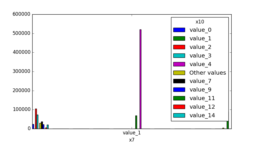
Both Features are Categorical
A shared histogram will be shown. If one or both features have more than 10 unique values, then the 10 most common values are shown, and the others are labeled “Other Values”.
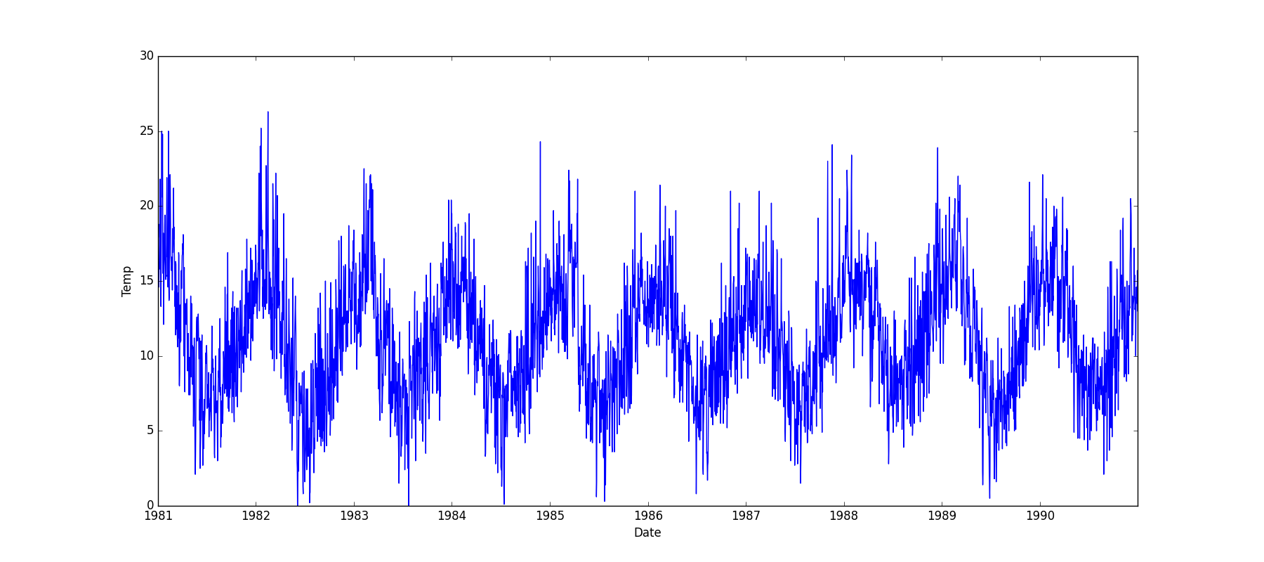
One Feature is Datetime Series and the Other is Numeric or Datetime Series
A line plot where the datetime series is on the x-axis is shown:
One Feature is Datetime Series and the Other is Categorical
If one feature is a datetime series and the other is either an object, a category, or a bool, then a
violin plot is shown. A violin plot is a combination of a boxplot and a kernel density estimate. If the categorical feature
has more than 10 unique values, then the 10 most common values are shown, and the others are labeled “Other Values”. The
datetime series will be on the x-axis:
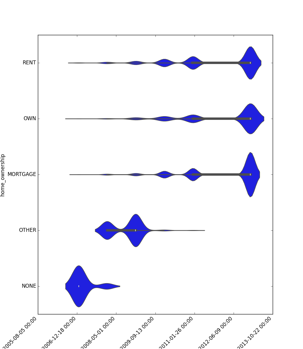
Here is an example for a boolean feature plot:

Choosing the Right Visualization
Use visualize_feature for a quick overview of individual features.
Use get_correlated_features and visualize_correlations to understand relationships between multiple features.
Use plot_correlation_dendrogram for a hierarchical view of feature relationships, especially useful for high-dimensional data.
Use plot_features_interaction to deep dive into the relationship between specific feature pairs.
By combining these visualizations, you can gain a comprehensive understanding of your dataset’s structure, which is crucial for effective data preprocessing, feature engineering, and model selection.
Extract Statistics DataFrame per Label
This method calculates comprehensive statistical metrics for numerical features grouped by label values. Use this when you want to:
Analyze how a numerical feature’s distribution varies across different categories
Detect potential patterns or anomalies in feature behavior per group
Generate detailed statistical summaries for reporting or analysis
Understand the relationship between features and target variables
- preprocess.extract_statistics_dataframe_per_label(df: DataFrame, feature_name: str, label_name: str) DataFrame[source]
Calculate comprehensive statistical metrics for a specified feature grouped by label.
This method computes various statistical measures for a given numerical feature, broken down by unique values in the specified label column. The statistics include count, null count, mean, standard deviation, min/max values and multiple percentiles.
- Parameters:
df – Input pandas DataFrame containing the data
feature_name – Name of the column to calculate statistics on
label_name – Name of the column to group by
- Returns:
DataFrame with statistical metrics for each unique label value, with columns: - count: Number of non-null observations - null_count: Number of null values - mean: Average value - min: Minimum value - 1_percentile: 1st percentile - 5_percentile: 5th percentile - 25_percentile: 25th percentile - median: 50th percentile - 75_percentile: 75th percentile - 95_percentile: 95th percentile - 99_percentile: 99th percentile - max: Maximum value
- Raises:
Code Example
Here’s how to use the method to analyze numerical features across different categories:
import pandas as pd
from ds_utils.preprocess import extract_statistics_dataframe_per_label

# Load your dataset
df = pd.DataFrame({
    'amount': [100, 200, 150, 300, 250, 175],
    'category': ['A', 'A', 'B', 'B', 'C', 'C']
})

# Calculate statistics for amount grouped by category
stats = extract_statistics_dataframe_per_label(
    df=df,
    feature_name='amount',
    label_name='category'
)
print(stats)
The output will be a DataFrame containing the following statistics for each category:
category |
count |
null_count |
mean |
min |
1_percentile |
5_percentile |
25_percentile |
median |
75_percentile |
95_percentile |
99_percentile |
max |
|---|---|---|---|---|---|---|---|---|---|---|---|---|
A |
2 |
0 |
150.0 |
100 |
100.0 |
100.0 |
100.0 |
150.0 |
200.0 |
200.0 |
200.0 |
200.0 |
B |
2 |
0 |
225.0 |
150 |
150.0 |
150.0 |
150.0 |
225.0 |
300.0 |
300.0 |
300.0 |
300.0 |
C |
2 |
0 |
212.5 |
175 |
175.0 |
175.0 |
175.0 |
212.5 |
250.0 |
250.0 |
250.0 |
250.0 |
This comprehensive set of statistics helps in understanding the distribution of numerical features across different categories, which can be valuable for:
Identifying outliers within specific groups
Understanding data skewness per category
Detecting potential data quality issues
Making informed decisions about feature engineering strategies
Compute Mutual Information
This method computes the mutual information between each feature and a specified target variable. Mutual information measures the dependency between two variables, with a higher value indicating a stronger relationship.
Use this when you want to:
Identify the most informative features for a classification task.
Perform feature selection based on the relevance of each feature to the target.
Gain insight into the underlying relationships within your data, which can guide feature engineering.
- preprocess.compute_mutual_information(df: DataFrame, features: List[str], label_col: str, *, n_neighbors: int = 3, random_state: int | RandomState | None = None, n_jobs: int | None = None, numerical_imputer: TransformerMixin = SimpleImputer(), discrete_imputer: TransformerMixin = SimpleImputer(strategy='most_frequent'), discrete_encoder: TransformerMixin = OrdinalEncoder(handle_unknown='use_encoded_value', unknown_value=-1)) DataFrame[source]
Compute mutual information scores between features and a target label.
This function calculates mutual information scores for specified features with respect to a target label column. Features are automatically categorized as numerical or discrete (boolean/categorical) and preprocessed accordingly before computing mutual information.
Mutual information measures the mutual dependence between two variables - higher scores indicate stronger relationships between the feature and the target label.
- Parameters:
df – Input pandas DataFrame containing the features and label
features – List of column names to compute mutual information for
label_col – Name of the target label column
n_neighbors – Number of neighbors to use for MI estimation for continuous variables. Higher values reduce variance of the estimation, but could introduce a bias.
random_state – Random state for reproducible results. Can be int or RandomState instance
n_jobs – The number of jobs to use for computing the mutual information. The parallelization is done on the columns. None means 1 unless in a joblib.parallel_backend context.
-1means using all processors.numerical_imputer – Sklearn-compatible transformer for numerical features (default: mean imputation)
discrete_imputer – Sklearn-compatible transformer for discrete features (default: most frequent imputation)
discrete_encoder – Sklearn-compatible transformer for encoding discrete features (default: ordinal encoding with unknown value handling)
- Returns:
DataFrame with columns ‘feature_name’ and ‘mi_score’, sorted by MI score (descending)
- Raises:
KeyError – If any feature or label_col is not found in DataFrame
ValueError – If features list is empty or label_col contains non-finite values
Code Example
This example uses a sample DataFrame to demonstrate the calculation of mutual information.
Here’s how to use the code:
import pandas as pd
from ds_utils.preprocess import compute_mutual_information

sample_df = pd.DataFrame({
    "value": [1.0, 2.0, 3.0, 4.0, 5.0, 6.0, 7.0, 8.0, 9.0, 10.0],
    "category": ["A", "A", "A", "B", "B", "B", "C", "C", "C", "C"],
    "text_col": ["x", "y", "z", "x", "y", "z", "x", "y", "z", "x"],
})
target = "category"
mutual_information_df = compute_mutual_information(sample_df, target)
print(mutual_information_df)
The following table will be the output:
feature |
mutual_information |
|---|---|
value |
0.046 |
text_col |
0.941 |