Unsupervised
The unsupervised module contains methods for calculating and visualizing evaluation performance of unsupervised models. These tools are primarily inspired by concepts covered in Google’s Machine Learning Crash Course, particularly related to clustering. For more information on clustering, see the Google ML Glossary on Clustering.
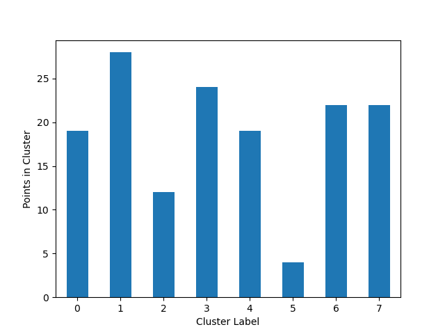
Plot Cluster Cardinality
The plot_cluster_cardinality function visualizes the number of points in each cluster, which can help identify imbalanced clusters or outliers.
- unsupervised.plot_cluster_cardinality(labels: ndarray, *, ax: Axes | None = None, **kwargs) Axes[source]
Plot the number of points per cluster as a bar chart.
Cluster cardinality is the number of examples per cluster.
- Parameters:
labels – Labels of each point.
ax – Axes object to draw the plot onto; if None, uses the current Axes.
kwargs – Additional keyword arguments passed to matplotlib.axes.Axes.bar().
- Returns:
The Axes object with the plot drawn onto it.
- Raises:
ValueError – If labels are empty.
In the following example, we’ll use the iris dataset from scikit-learn and create a simple K-Means algorithm with k=8 to plot how many points go to each cluster:
from matplotlib import pyplot as plt
from sklearn.cluster import KMeans
from ds_utils.unsupervised import plot_cluster_cardinality


# Create and fit the K-Means model
estimator = KMeans(n_clusters=8, random_state=42)
estimator.fit(X)

# Plot the cluster cardinality
plot_cluster_cardinality(estimator.labels_)
plt.show()
And the following image will be shown:
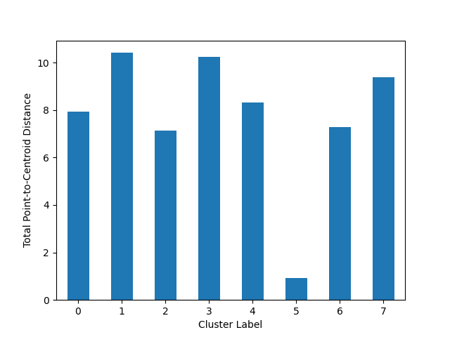
Plot Cluster Magnitude
The plot_cluster_magnitude function visualizes the total point-to-centroid distance for each cluster, which can help identify compact or dispersed clusters.
- unsupervised.plot_cluster_magnitude(X: ndarray, labels: ndarray, cluster_centers: ndarray, distance_function: Callable[[ndarray, ndarray], float], *, ax: Axes | None = None, **kwargs) Axes[source]
Plot the Total Point-to-Centroid Distance per cluster as a bar chart.
Cluster magnitude is the sum of distances from all examples to the centroid of the cluster.
- Parameters:
X – Training instances.
labels – Labels of each point.
cluster_centers – Coordinates of cluster centers.
distance_function – Function to calculate the distance between an instance and its cluster center. It should take two ndarrays (instance and center) and return a float.
ax – Axes object to draw the plot onto; if None, uses the current Axes.
kwargs – Additional keyword arguments passed to matplotlib.axes.Axes.bar().
- Returns:
The Axes object with the plot drawn onto it.
- Raises:
ValueError – If input arrays have inconsistent shapes or if distance_function is invalid.
Here’s an example of how to use the plot_cluster_magnitude function:
from matplotlib import pyplot as plt
from sklearn.cluster import KMeans
from scipy.spatial.distance import euclidean
from ds_utils.unsupervised import plot_cluster_magnitude


# Create and fit the K-Means model
estimator = KMeans(n_clusters=8, random_state=42)
estimator.fit(X)

#Plot the cluster magnitude
plot_cluster_magnitude(X, estimator.labels_, estimator.cluster_centers_, euclidean)
plt.show()
And the following image will be shown:
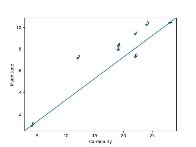
Magnitude vs. Cardinality
The plot_magnitude_vs_cardinality function creates a scatter plot of cluster magnitude against cardinality, which can help identify anomalous clusters.
- unsupervised.plot_magnitude_vs_cardinality(X: ndarray, labels: ndarray, cluster_centers: ndarray, distance_function: Callable[[ndarray, ndarray], float], *, ax: Axes | None = None, **kwargs) Axes[source]
Plot magnitude against cardinality as a scatter plot to find anomalous clusters.
Higher cluster cardinality tends to result in a higher cluster magnitude. Clusters are considered anomalous when cardinality doesn’t correlate with magnitude relative to the other clusters.
- Parameters:
X – Training instances.
labels – Labels of each point.
cluster_centers – Coordinates of cluster centers.
distance_function – Function to calculate the distance between an instance and its cluster center. It should take two ndarrays (instance and center) and return a float.
ax – Axes object to draw the plot onto; if None, uses the current Axes.
kwargs – Additional keyword arguments passed to matplotlib.axes.Axes.scatter().
- Returns:
The Axes object with the plot drawn onto it.
- Raises:
ValueError – If input arrays have inconsistent shapes or if distance_function is invalid.
Here’s how to use the plot_magnitude_vs_cardinality function:
from matplotlib import pyplot as plt
from sklearn.cluster import KMeans
from scipy.spatial.distance import euclidean
from ds_utils.unsupervised import plot_magnitude_vs_cardinality


# Create and fit the K-Means model
estimator = KMeans(n_clusters=8, random_state=42)
estimator.fit(X)

# Plot magnitude vs. cardinality
plot_magnitude_vs_cardinality(X, estimator.labels_, estimator.cluster_centers_, euclidean)
plt.show()
And the following image will be shown:
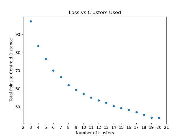
Optimum Number of Clusters
The plot_loss_vs_cluster_number function helps determine the optimal number of clusters by plotting the total magnitude (sum of distances) as loss against the number of clusters.
- unsupervised.plot_loss_vs_cluster_number(X: ndarray, k_min: int, k_max: int, distance_function: Callable[[ndarray, ndarray], float], *, algorithm_parameters: Dict[str, Any] = None, ax: Axes | None = None, **kwargs) Axes[source]
Plot the Total magnitude (sum of distances) as loss against the number of clusters.
This method runs the KMeans algorithm with increasing cluster numbers and plots the resulting loss.
- Parameters:
X – Training instances.
k_min – The minimum cluster number.
k_max – The maximum cluster number.
distance_function – Function to calculate the distance between an instance and its cluster center. It should take two ndarrays (instance and center) and return a float.
algorithm_parameters – Parameters to use for the KMeans algorithm. If None, default parameters will be used.
ax – Axes object to draw the plot onto; if None, uses the current Axes.
kwargs – Additional keyword arguments passed to matplotlib.axes.Axes.scatter().
- Returns:
The Axes object with the plot drawn onto it.
- Raises:
ValueError – If k_min > k_max or if invalid parameters are provided.
Here’s an example of how to use the plot_loss_vs_cluster_number function:
from matplotlib import pyplot as plt
from scipy.spatial.distance import euclidean
from ds_utils.unsupervised import plot_loss_vs_cluster_number


# Plot loss vs. number of clusters
plot_loss_vs_cluster_number(X, 3, 20, euclidean)
plt.show()
And the following image will be shown: