Visualize Accuracy Grouped by Probability
This method was created due to the lack of maintenance of the package EthicalML / xai.
- ds_utils.metrics.probability_analysis.visualize_accuracy_grouped_by_probability(y_test: ndarray, labeled_class: str | int, probabilities: ndarray, threshold: float = 0.5, display_breakdown: bool = False, bins: int | Sequence[float] | IntervalIndex | None = None, *, ax: Axes | None = None, **kwargs) Axes[source]
Plot a stacked bar chart of classifier results by probability bins.
Receives true test labels and classifier probability predictions, divides and classifies the results, and finally plots a stacked bar chart with the results. Original code.
- Parameters:
y_test – array, shape = [n_samples]. Ground truth (correct) target values.
labeled_class – the class to inquire about.
probabilities – array, shape = [n_samples]. Classifier probabilities for the labeled class.
threshold – the probability threshold for classifying the labeled class.
display_breakdown – if True, the results will be displayed as “correct” and “incorrect”; otherwise as “true-positives”, “true-negatives”, “false-positives” and “false-negatives”.
bins – int, sequence of scalars, or IntervalIndex. The criteria to bin by.
ax – matplotlib Axes object, optional. The axes to plot on.
kwargs – additional keyword arguments to be passed to the plot function.
- Returns:
The Axes object with the plot drawn onto it.
Code Example
The example uses a small sample from a dataset from kaggle, which a dummy bank provides loans.
Let’s see how to use the code:
from matplotlib import pyplot as plt
from sklearn.ensemble import RandomForestClassifier
from ds_utils.metrics.probability_analysis import visualize_accuracy_grouped_by_probability
# Load and prepare the data
loan_data = pandas.read_csv(path/to/dataset, encoding="latin1", nrows=11000,
parse_dates=["issue_d"])
loan_data = loan_data.drop(["id", "application_type"], axis=1)
loan_data = loan_data.sort_values("issue_d")
loan_data = pandas.get_dummies(loan_data)
# Prepare train and test sets
train = (loan_data.head(int(loan_data.shape[0] * 0.7))
.sample(frac=1)
.reset_index(drop=True)
.drop("issue_d", axis=1))
test = loan_data.tail(int(loan_data.shape[0] * 0.3)).drop("issue_d", axis=1)
# Define features to use for classification
selected_features = [
'emp_length_int', 'home_ownership_MORTGAGE', 'home_ownership_RENT',
'income_category_Low', 'term_ 36 months', 'purpose_debt_consolidation',
'purpose_small_business', 'interest_payments_High'
]
# Train the classifier
classifier = RandomForestClassifier(
min_samples_leaf=int(train.shape[0] * 0.01),
class_weight="balanced",
n_estimators=1000,
random_state=0
)
classifier.fit(train[selected_features], train["loan_condition_cat"])
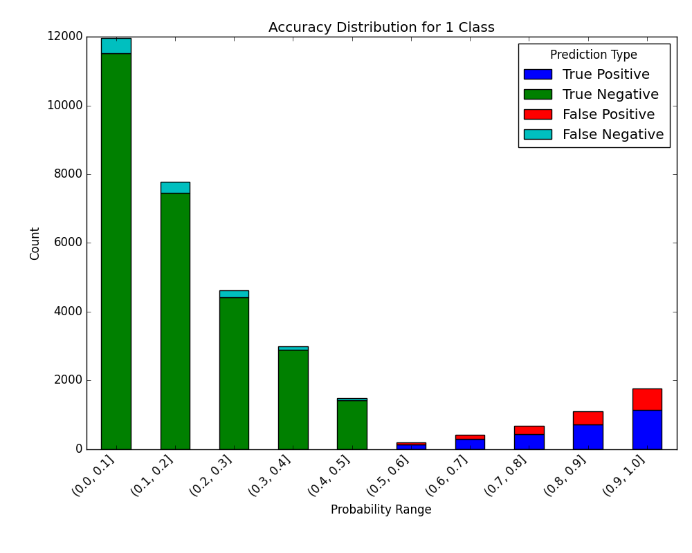
# Make predictions and visualize accuracy
probabilities = classifier.predict_proba(test[selected_features])
visualize_accuracy_grouped_by_probability(
test["loan_condition_cat"],
1,
probabilities[:, 1],
display_breakdown=False
)
plt.show()
And the following image will be shown:
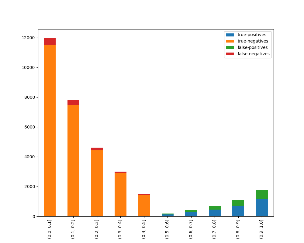
If we choose to display the breakdown:
visualize_accuracy_grouped_by_probability(
    test["loan_condition_cat"],
    1,
    probabilities[:, 1],
    display_breakdown=True
)
plt.show()
And the following image will be shown:
Plot Error Analysis Chart
The plot_error_analysis_chart function automates the creation of an error analysis DataFrame (computing correct, false_positive, false_negative) and visualizes the prediction errors relative to their predicted probabilities using a violin plot. It supports both binary and multi-class classification using a one-vs-rest scheme against a specified positive class.
- ds_utils.metrics.probability_analysis.plot_error_analysis_chart(y_true: ndarray | List, y_pred: ndarray | List, y_proba: ndarray | List, positive_class: int | str, *, classes: List | None = None, ax: Axes | None = None, **kwargs) Axes[source]
Plot an error analysis chart showing prediction errors relative to predicted probabilities.
Builds an internal DataFrame with the predicted probability for the
positive_classand anerror_typecolumn (correct, false_positive, false_negative), and draws a violin plot showing the distribution of predicted probabilities across these error types.For binary classification
y_probashould be 1-D (probability of the positive class). For multi-class classificationy_probashould be 2-D with shape(n_samples, n_classes); the column corresponding topositive_classis determined viaclasses(or inferred fromnp.unique(y_true)whenclassesisNone). Error types are computed using a one-vs-rest scheme againstpositive_classby comparingy_trueandy_preddirectly. The original spec included athresholdfloat parameter for re-thresholding raw probabilities; this implementation intentionally omits it — callers should apply any desired threshold to producey_predbefore calling this function.- Parameters:
y_true – Array-like of true labels.
y_pred – Array-like of predicted labels.
y_proba – Array-like of predicted probabilities. 1-D for binary or 2-D with shape
(n_samples, n_classes)for multi-class.positive_class – The class to treat as the positive class.
classes – Ordered list of class labels matching the columns of
y_probawhen it is 2-D. IfNone, inferred fromnp.unique(y_true).ax – Axes object to draw the plot onto, otherwise uses the current Axes.
kwargs – Additional keyword arguments passed to
seaborn.violinplot().
- Returns:
Axes object with the plot drawn onto it.
- Raises:
ValueError – If inputs have mismatched lengths,
y_probahas an invalid number of dimensions, orpositive_classis not found inclasses.
Code Example
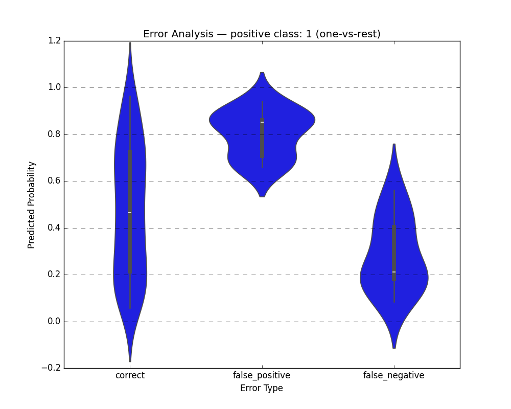
Binary Classification
import matplotlib.pyplot as plt
from sklearn.datasets import load_breast_cancer
from sklearn.model_selection import train_test_split
from sklearn.tree import DecisionTreeClassifier
from ds_utils.metrics.probability_analysis import plot_error_analysis_chart

# Load dataset and split
X, y = load_breast_cancer(return_X_y=True)
X_train, X_test, y_train, y_test = train_test_split(X, y, random_state=42)

# Train a classifier
clf = DecisionTreeClassifier(random_state=42)
clf.fit(X_train, y_train)

y_pred = clf.predict(X_test)
y_proba = clf.predict_proba(X_test)[:, 1]  # probability of the positive class

# Plot error analysis
plot_error_analysis_chart(y_test, y_pred, y_proba, positive_class=1)
plt.show()
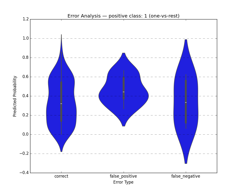
Multi-class Classification
import matplotlib.pyplot as plt
from sklearn.datasets import load_iris
from sklearn.model_selection import train_test_split
from sklearn.tree import DecisionTreeClassifier
from ds_utils.metrics.probability_analysis import plot_error_analysis_chart

# Load dataset and split
X, y = load_iris(return_X_y=True)
X_train, X_test, y_train, y_test = train_test_split(X, y, random_state=42)

# Train a classifier
clf = DecisionTreeClassifier(random_state=42)
clf.fit(X_train, y_train)

y_pred = clf.predict(X_test)
y_proba = clf.predict_proba(X_test)

# Plot error analysis for class 1 (one-vs-rest)
plot_error_analysis_chart(
    y_test, y_pred, y_proba,
    positive_class=1,
    classes=clf.classes_.tolist()
)
plt.show()