Regression Metrics
Regression Error Characteristic (REC) curves provide a powerful framework for evaluating and comparing regression models, generalizing the Receiver Operating Characteristic (ROC) curve used in classification.
Background and Theory
The REC curve was introduced by Bi & Bennett (2003) in “Regression error characteristic curves” (Proceedings of the Twentieth International Conference on Machine Learning, pp. 43-50) as a method to visualize the cumulative distribution of errors in regression modeling.
Unlike classification where predictions are binary, regression predictions fall along a continuous scale. The REC curve handles this by plotting Error Tolerance on the x-axis against Accuracy on the y-axis. Here, “accuracy” is defined as the proportion of predictions that fall within the specified error tolerance.
This framework was further extended into the Regression ROC (RROC) space by Hernández-Orallo (2013) in “ROC curves for regression” (Pattern Recognition, 46(12), 3395-3411, doi:10.1016/j.patcog.2013.06.014). This work demonstrated that the area under/over the curve relates deeply to the variance and expected magnitude of regression errors.
### Interpreting the Area Over the Curve (AOC)
In classification ROC curves, a larger Area Under the Curve (AUC) is better. For REC curves, we look at the Area Over the Curve (AOC):
0.0 is Perfect: A perfect model has zero error for every prediction. Its REC curve jumps to 1.0 (100% accuracy) instantly at an error tolerance of 0, meaning there is zero area over the curve.
Lower is Better: The smaller the AOC, the closer the predictions are to the true values.
Normalized Score: The AOC is typically normalized by dividing by the maximum absolute error observed, yielding a bounded metric in [0, 1]. This makes it easier to compare performance across different datasets and scales.
Regression AUC Score
- ds_utils.metrics.regression.regression_auc_score(y_true: ndarray, y_pred: ndarray, sample_weight: ndarray | None = None, normalize: bool = True) float[source]
Calculate Area Over the REC Curve (AOC) / Regression AUC.
This is the standalone version of the AUC calculation used in
plot_rec_curve_with_annotations(). Lower values indicate better model performance. The AOC is calculated as the area between the REC curve and the y=1 line.When normalized, it is divided by the maximum absolute error to give a score in [0, 1].
- Parameters:
y_true – array-like of shape (n_samples,). True target values.
y_pred – array-like of shape (n_samples,). Predicted target values.
sample_weight – array-like of shape (n_samples,), default=None. Sample weights.
normalize – bool, default=True. If True, normalize by maximum absolute error to get a score in [0, 1] range.
- Returns:
The regression AUC score. Lower is better (0 = perfect, 1 = worst possible).
- Raises:
ValueError – If shapes of y_true and y_pred do not match.
Code Example
import numpy as np
from ds_utils.metrics.regression import regression_auc_score

# Generate dummy data
y_true = np.array([1.0, 2.0, 3.0, 4.0, 5.0, 6.0, 7.0, 8.0, 9.0, 10.0])
y_pred_good = np.array([1.1, 2.2, 2.8, 4.1, 5.0, 5.9, 7.2, 7.8, 9.1, 10.0])
y_pred_bad = np.array([2.0, 3.5, 1.5, 5.5, 3.0, 8.0, 5.5, 9.5, 7.0, 12.0])

# Calculate AOC scores (normalized)
good_aoc = regression_auc_score(y_true, y_pred_good)
bad_aoc = regression_auc_score(y_true, y_pred_bad)

print(f"Good Model AOC: {good_aoc:.4f}")
print(f"Bad Model AOC:  {bad_aoc:.4f}")
Output:
Good Model AOC: 0.1000
Bad Model AOC:  0.4200
Plot REC Curve with Annotations
- ds_utils.metrics.regression.plot_rec_curve_with_annotations(y_true: ndarray, regressors_names_and_predictions_dict: Dict[str, ndarray], *, sample_weight: ndarray | None = None, normalize_auc: bool = True, fig: Figure | None = None, mode: str | None = 'lines+markers', show_legend: bool = True, **kwargs) Figure[source]
Plot Regression Error Characteristic (REC) curves with AUC annotations.
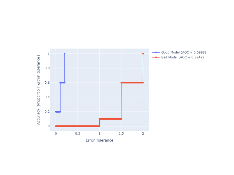
The REC curve shows the cumulative distribution of absolute errors, allowing comparison of regression model performance. The Area Over the Curve (AOC) is calculated and displayed in the legend for each regressor.
- Parameters:
y_true – array-like of shape (n_samples,). True target values.
regressors_names_and_predictions_dict – mapping from regressor name to predictions.
sample_weight – array-like of shape (n_samples,), default=None. Sample weights.
normalize_auc – bool, default=True. If True, normalize AOC by maximum absolute error to get a score in [0, 1] range.
fig – plotly’s Figure object, optional. The figure to plot on.
mode – str, default=’lines+markers’. Determines the drawing mode for this scatter trace.
show_legend – bool, default=True. Whether to display legend in the plot.
kwargs – additional keyword arguments to be passed to the plot function.
- Returns:
The Figure object with the plot drawn onto it.
- Raises:
ValueError – If the input data is invalid or inconsistent.
Code Example
We can use the plot_rec_curve_with_annotations function to visually compare the two models from the previous example. The Plotly backend allows for interactive exploration of the error tolerances.
import numpy as np
from ds_utils.metrics.regression import plot_rec_curve_with_annotations

# Generate dummy data
y_true = np.array([1.0, 2.0, 3.0, 4.0, 5.0, 6.0, 7.0, 8.0, 9.0, 10.0])
predictions = {
    "Good Model": np.array([1.1, 2.2, 2.8, 4.1, 5.0, 5.9, 7.2, 7.8, 9.1, 10.0]),
    "Bad Model": np.array([2.0, 3.5, 1.5, 5.5, 3.0, 8.0, 5.5, 9.5, 7.0, 12.0]),
}

# Plot REC curves
fig = plot_rec_curve_with_annotations(y_true, predictions)
fig.show()
And the following interactive graph will be shown: